FotMob: Adding a Feature
This is a project that I worked on in my free time. It is based off a soccer app called FotMob that I use almost everyday! Using Figma I was able to design a feature for a more user friendly version of FotMob. Using this app for almost 4 years, I recognized some painpoints that could significantly improve the app and its function!
Project Type
UI Design | Wireframe | Prototype | Branding | Mobile Design
Date
05/05/2023
Timeframe
Week long design sprint
Softwares Used
Figma | Illustrator | Photoshop | Procreate
The Design Thinking Process
My design thinking process starts with a defined problem, followed by getting insights from using and arriving at conclusions to redefine the problem if needed, continues with brainstorming all possible solutions and finally prototyping and testing the best ones!
Design Thinking is a human-centric methodology for creative problem solving. The goal of the process is to come up with a useful product or feature that people will love.
FotMob is a soccer app that allows soccer enthusiasts, like myself, to easily follow along live matches, leagues and news! It integrates leagues from all over the world and its main goal is to provide users with live match statistics quickly and efficiently.
Good design is actually a lot harder to notice than poor design, in part because good designs fit our needs so well that the design is invisible.
~Donald A. Norman, The Design of Everyday Things
This app already does a fantastic job of spreading soccer information effectively. However, using this app for over 4 years, I realized there are still some pain points. My design challenge will be to solve the pain of the clustered design! Which can sometimes make the navigation of the app super confusing.
Phase 1: Empathize
For this phase, I put myself in the user’s shoes.
To do this, I conducted interviews with potential users, in my case, any soccer fans.
The goal of the interviews I conducted were to discover what my users main pain points are when using this app. These were some of the questions I asked them:
“What is your main reason for using this app?”
“How easy is it to find the live match of the team you support?”
“Can you tell me about the last time you used this app to complete a key task? Like pulling up the live Champions League game?”
“What other apps do you use for similar functions, and how does this app compare?”
And here are the insights I gathered from the interviews:
Too cluttered: 5 out of the 6 people I interviewed said that they felt super overwhelmed with all the leagues, especially when they first opened the app. “Once I find the specific game I’m looking for, I love the app. But there are too many leagues and teams on the homepage.”
Too many taps: users have stated that it takes way too long to find their supporting team's game. “It shouldn’t take more than one tap to find my team’s game.”
Phase 2: Define
With the insights we got from our empathy phase, in the define phase we can revisit the initial design challenge and re-define the problem if we need to.
Phase 3: Ideate
After redefining the problem, it is time to work our brains out to generate ideas that can solve it. In this phase we have 2 sections:
Diverge (Create Choices): brainstorm and come up with as many ideas as possible. No such thing as stupid ideas during this step! Here are the ones I came up with:
Users can delete/remove leagues and teams from their homepage that they are not interested in.
Have all the live matches towards the top of the screen.
Create a widget for the home screen that the users can add. This widget will showcase live scores or live table standings.
Have a favorites section on the homepage that allows users to favorite their teams and leagues.
When users first open the app, let them select the teams and leagues they would like to follow. Automatically customize their homepage based on their choices.
Allow users to select their favorite team. When they open the app and their team is playing a game. It automatically opens that game.
Converge (Make Decision): select the best ideas that I will take into the next phase. In this case, I will go with these:
Phase 4: Prototype
With the solution in mind, I designed low fidelity and high fidelity prototypes.

Phase 5: Test
With the solution in mind, I designed low fidelity and high fidelity prototypes:
Final Thoughts
Some learnings I got from this challenge:
Users are the source of insights we need to design a solution. The problem you are trying to solve might not be your own. The key is to have empathy towards your users.
There are no bad ideas, so brain-storm like my life depends on it.
Design thinking is a user-centered methodology that will start with a problem by our users and end with a solution from the insight you gained from our users. It is an iterative process, so we can go through all the phases again and again until we find the final solution to the user’s problem.
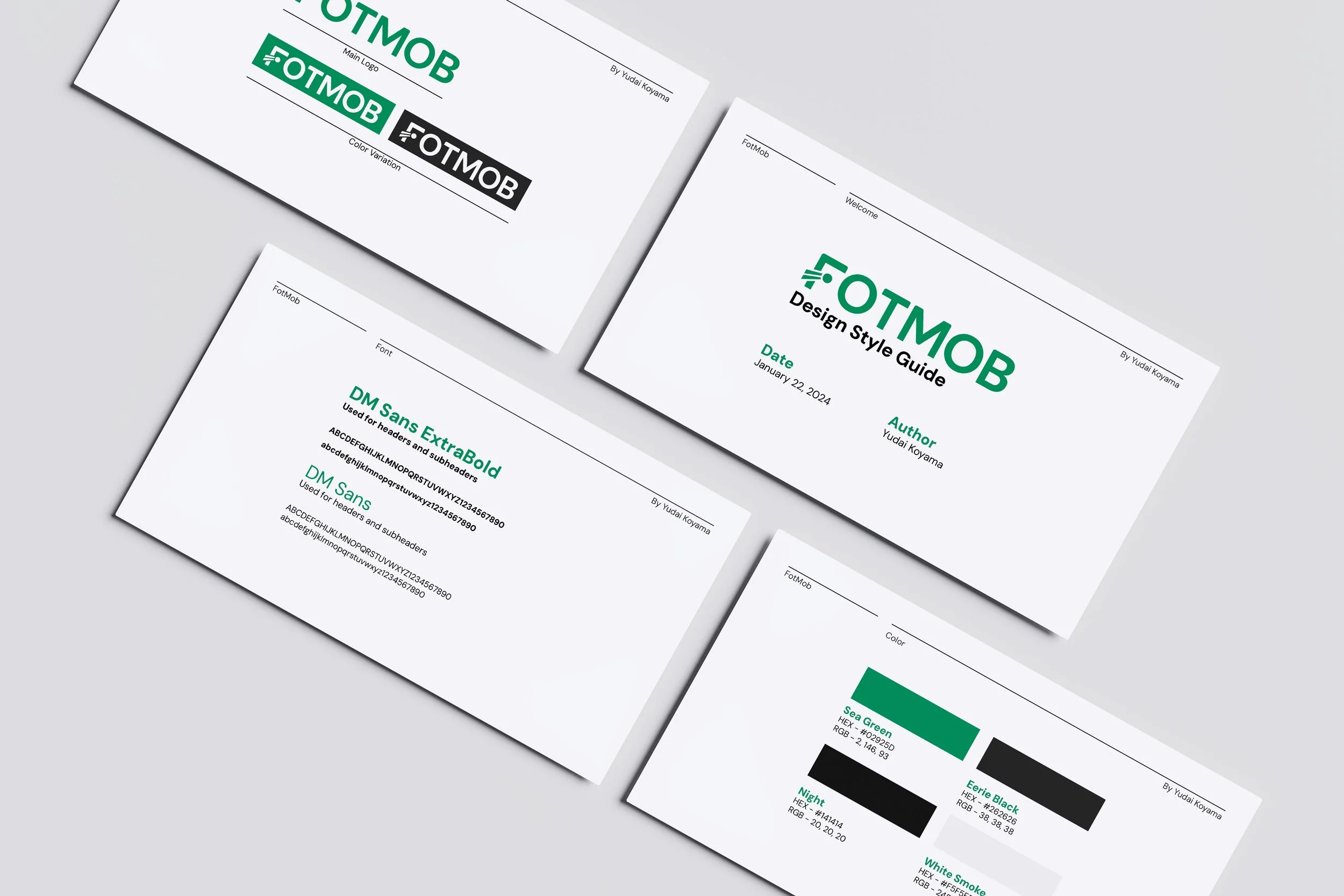
Design Style Guide


Initial Rough Draft
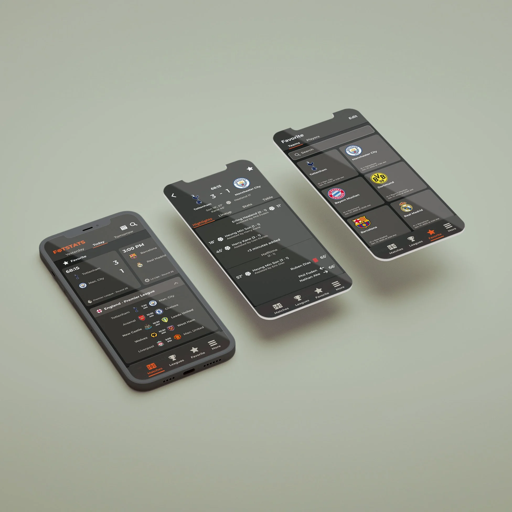
On the home page, leagues are collapsable so the user will not have to see all the leagues that are playing that day.
A favorites category at the top. Easy access and display for the teams that you love.
A favorites page to quickly see all the teams and players you love.
This page also shows you when they play their next match.
Once you click on a match, it will take you to this page. This match information page will show you important highlights like when they scored a goal and quick stats.


