
In Sync: A Homepage Hero for Freshworks
A design challenge concept that turns Freshworks' message into motion: people, systems, and AI flow into a single ticket and resolve it.
The brief:
Design one desktop section for the Freshworks homepage that introduces the company's value to prospective customers. The headline was set: “Bring people, systems, and AI in sync." The direction was open: a fresh interpretation of the brand, balancing visual storytelling, clarity, and usability.
Project Type
Design Challenge | UI Design | Wireframes | Prototypes
Role:
Sole Designer
Timeline
11/9/2026
Tools
Figma, Figma Make, Claude
Platform:
Marketing website
My Approach
Where I started:
Before designing, I studied freshworks.com to understand the system I was working inside:
Type: Lora headlines, with the key phrase set in bold italic; Inter for body text.
Color: black and off-white sections, with vivid accent colors from the customer stories.
Motif: a flowing ribbon of colored particles in the hero and closing banner.
Voice: one word everywhere: uncomplicated.
My goal:
Stay inside that system, and use it to tell a story it wasn't telling yet. The headline describes three things coming together, so the design should show it happening, not just say it.
Version 1
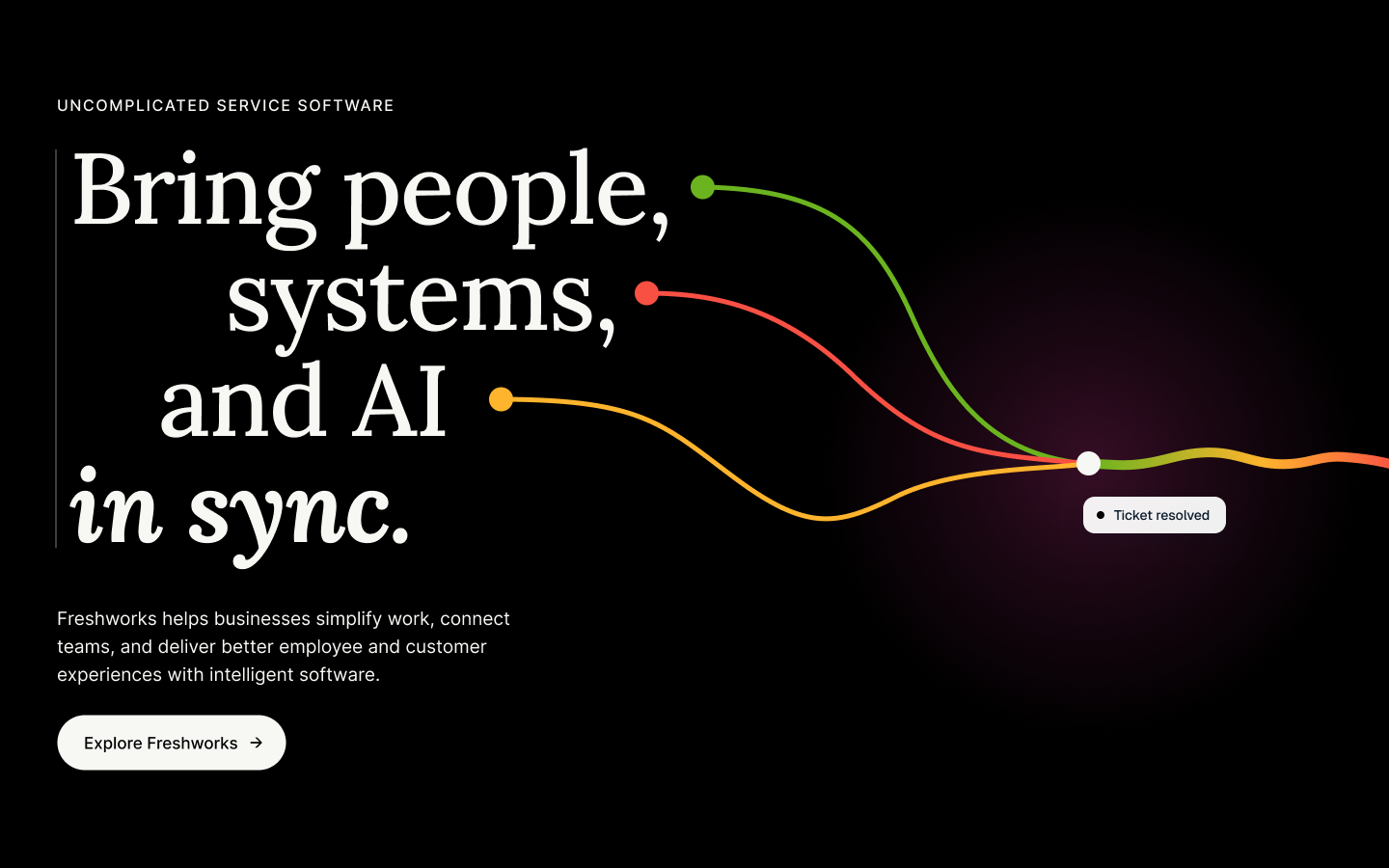
Concept: the words become the threads
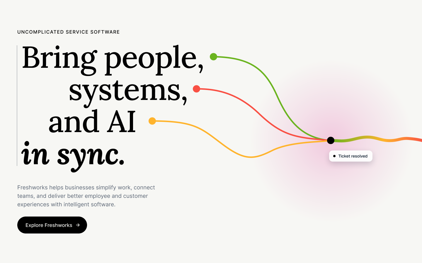
The headline is set out of step: "people," "systems," and "and AI" each sit at a different offset, and each ends in a colored dot. Each dot starts a thread. The threads flow right, meet at one point, and continue as a single line. Only "in sync." lines up, in Lora bold italic.
Key decisions
Type carries the story. The stagger shows the problem; the one aligned line is the answer, using Freshworks' own emphasis style.
The threads begin where the words end. The eye moves from the words, along the threads, to the meeting point, which sits level with "in sync."
Color from the customer-story palette. Green, coral, and yellow blend into one line, so each contribution stays visible as they move together.
Restraint. One CTA, one outcome chip ("Ticket resolved"), and generous space.
I delivered light and dark versions, matching the two section styles on the homepage.
The Feedback
The design team's review was specific, and fair. What worked: the brand connection, the minimal approach, and using type as a design tool rather than just a container for words. What didn't, in three themes:
Minimal needs to be refined. With so few elements, every detail shows, and the execution wasn't polished enough to carry it.
Bolder, more enterprise-level. For a homepage hero, the concept needed more scale and more conviction.
More output, more AI. They expected more within the time, such as an interactive prototype, and read the result as not leaning into AI tools.
I agreed with all three, so I rebuilt it.
Version 2
Concept: the words flow into the product. The staggered headline stays. Now each thread is a stream of particles that flows into its own row of a live support ticket. People: Maria from IT picks it up. Systems: the laptop's asset record is matched. AI: Freddy suggests the fix. When all three arrive, the ticket resolves, and the particles leave as a ribbon.
The Feedback and What Changed
Bolder, more enterprise-level: The hero shows the product working: a Freddy AI ticket that people, systems, and AI resolve together. Added a second CTA and a credibility line (“Trusted by 74,000+ businesses").
Feel more like Freshworks: The threads became particle streams that exit as a ribbon, extending the homepage's signature particle motif, on their black section style.
Minimal needs refinement: Tighter grid and spacing; the ticket card and buttons built as Figma components; depth through layering and shadow.
More output, more AI: A working interactive prototype, built with AI (see below).
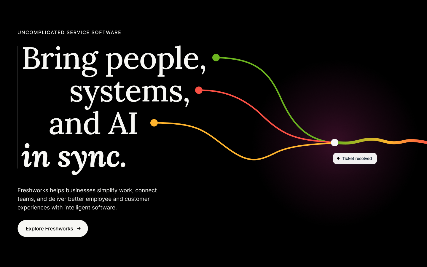
Before
After
Interaction and AI Workflow
The sequence (about 6 seconds):
The headline lines fade in, out of step; “in sync." lands last.
Each dot pulses and releases a particle stream toward its ticket row.
The rows arrive one by one: people, then systems, then AI.
The status changes from Open to “Resolved in 4 min," and the ribbon flows out.
Hovering a headline line highlights its thread and ticket row and dims the rest, so the connection reads both ways. A Replay button restarts the sequence, and reduced-motion settings show the resolved state without animation.
How I used AI. I used AI as a working partner at each stage, and kept the design decisions:
Exploration: Claude generated a moodboard and rough directions in Figma, so I could compare concepts quickly before committing.
Build: I assembled the v2 layout in Figma. I refined spacing, type, curves, and the ticket content.
Prototype: Figma Make turned the design into a coded, interactive prototype from my prompts. I iterated 4 times, fixing the layout scaling, the status pill, and the secondary button.
The result: v2, including a live prototype, in 2 hours.
Reflection
What I learned
A time box is a minimum, not a target. With AI in the workflow, the bar for what's possible in 90 minutes has moved. Show what you plus your tools can produce.
Minimal has to be refined. Fewer elements means every detail carries more weight. Either polish it completely or go bold.
Show the product, not just the idea. An enterprise hero earns trust by showing the software doing real work.
Feedback is fuel. The most useful part of this project was rebuilding it.
What I'd do next: design the mobile layout (the threads run top to bottom into the ticket), and measure the hero against the current one: scroll depth, CTA click-through, and time in section.
Design challenge concept. Not affiliated with or endorsed by Freshworks. Freshworks and Freddy AI are trademarks of Freshworks Inc.
View Next Project!
View Next Project!

Fotmob: Adding a Feature
User Research | Wireframes | Branding | Prototype | UX/UI Design