
Thompson Hospitality: Nutrition Kiosk
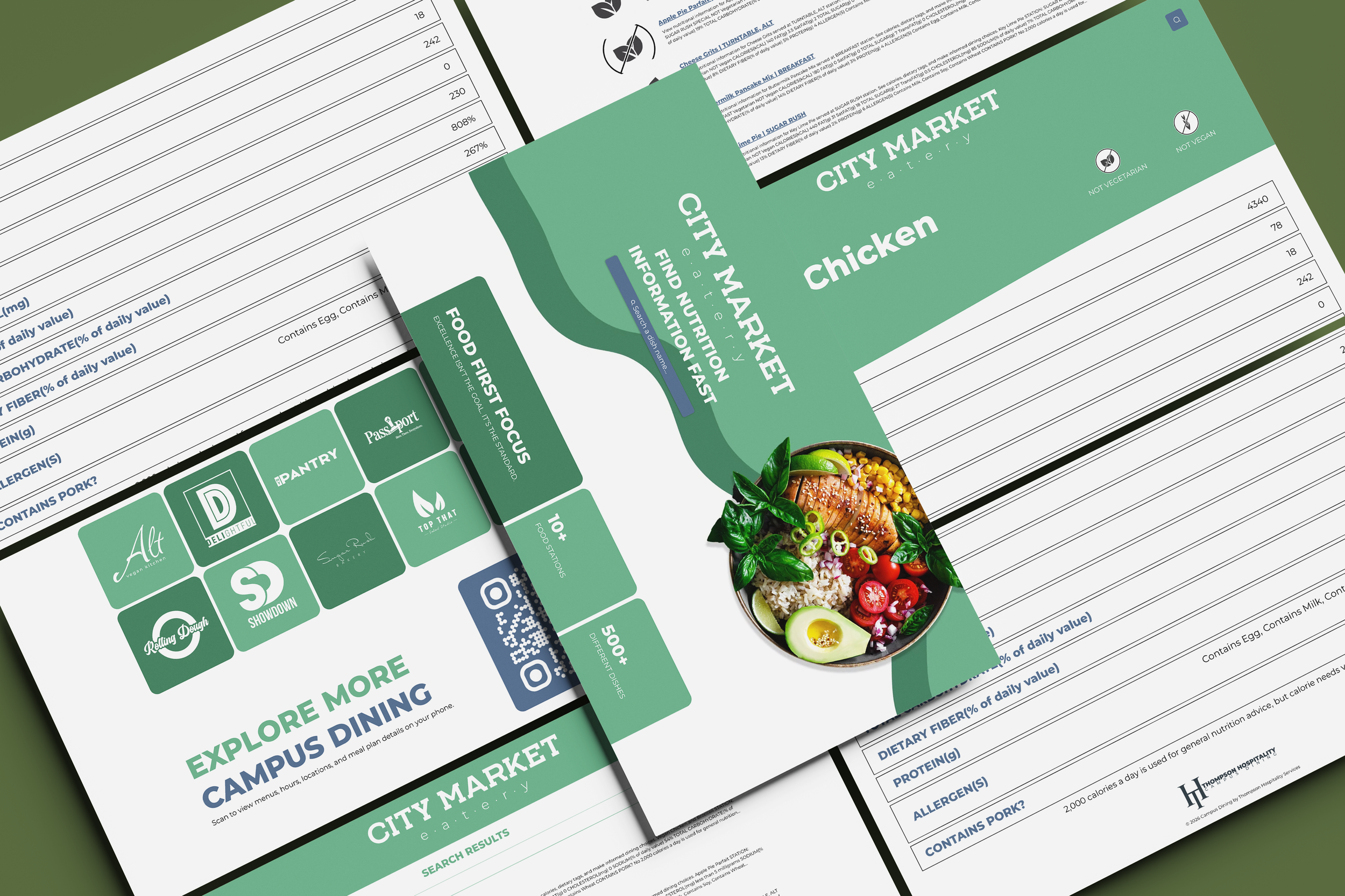
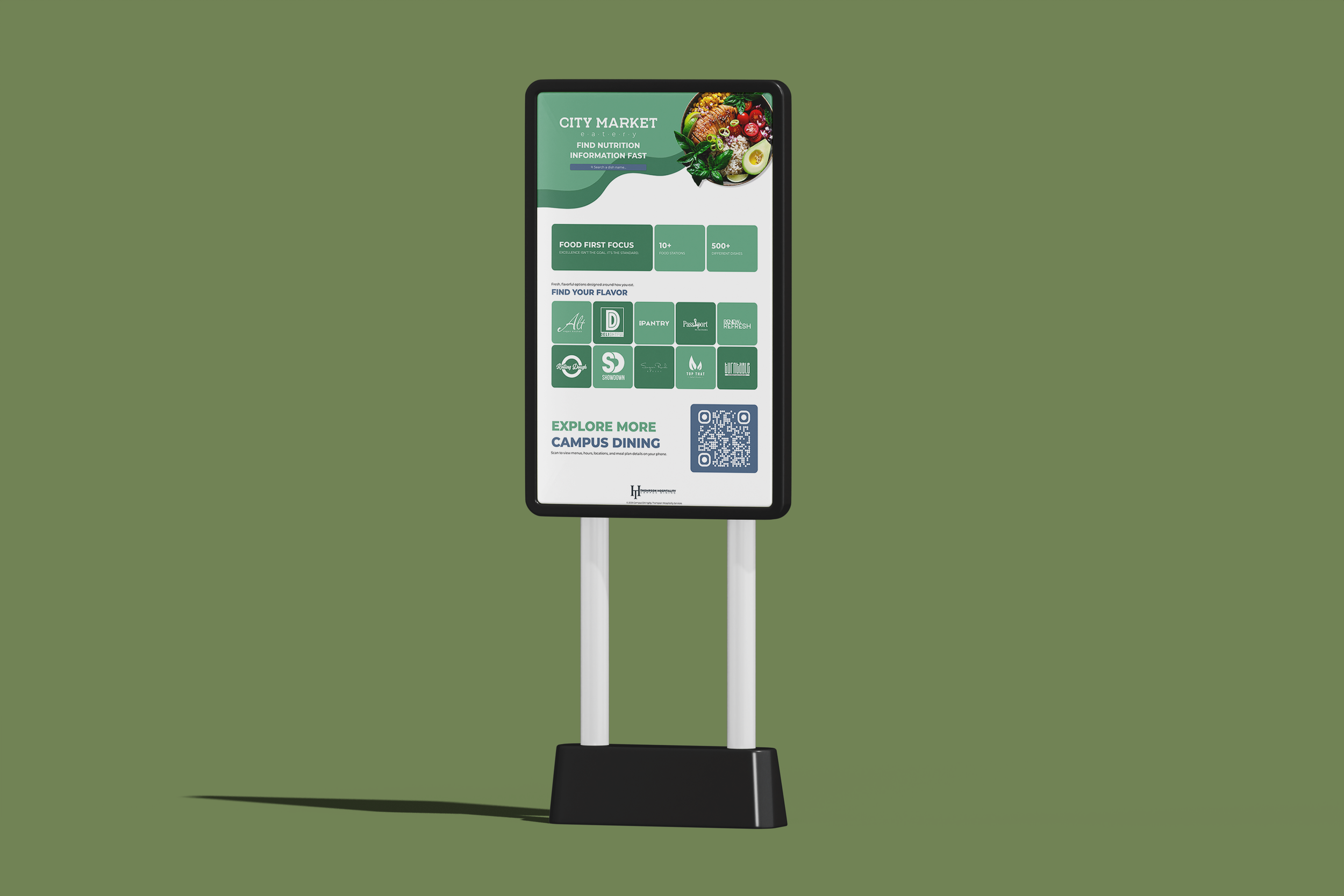
Dining hall anxiety is a daily reality for students with dietary restrictions. To foster a more inclusive campus environment, I designed a self-service kiosk that provides instant transparency into daily menus.
Faced with a compressed, mid-academic-year timeline and limited budget, I focused on high-impact safety features, streamlining the design to ensure no student has to guess what is in their meal.
Project goal:
Because “what's for dinner?" shouldn't be a stressful question, I designed this kiosk to be a reliable advocate for students with allergies and giving them the transparency to eat with confidence.
Measurable Target:
A streamlined digital resource that empowers students to make informed, safe, and confident choices. By prioritizing a clear information hierarchy, I achieved a target <20-second Time-on-Task for students to identify critical allergens or dietary triggers.
Project Type
UX Design Process | Product Design | UI Design | UX Research | Wireframes | Prototypes | Usability Testing | Accessibility | Agile Methodology
Role:
Lead UX Designer
Start Date
05/19/2025
End Date
08/04/2025
Audience:
Students with dietary restrictions.
Tools
Figma, Adobe Creative Cloud, and Wix Studio
Platform:
Physical Kiosk Interface
Project Methodology
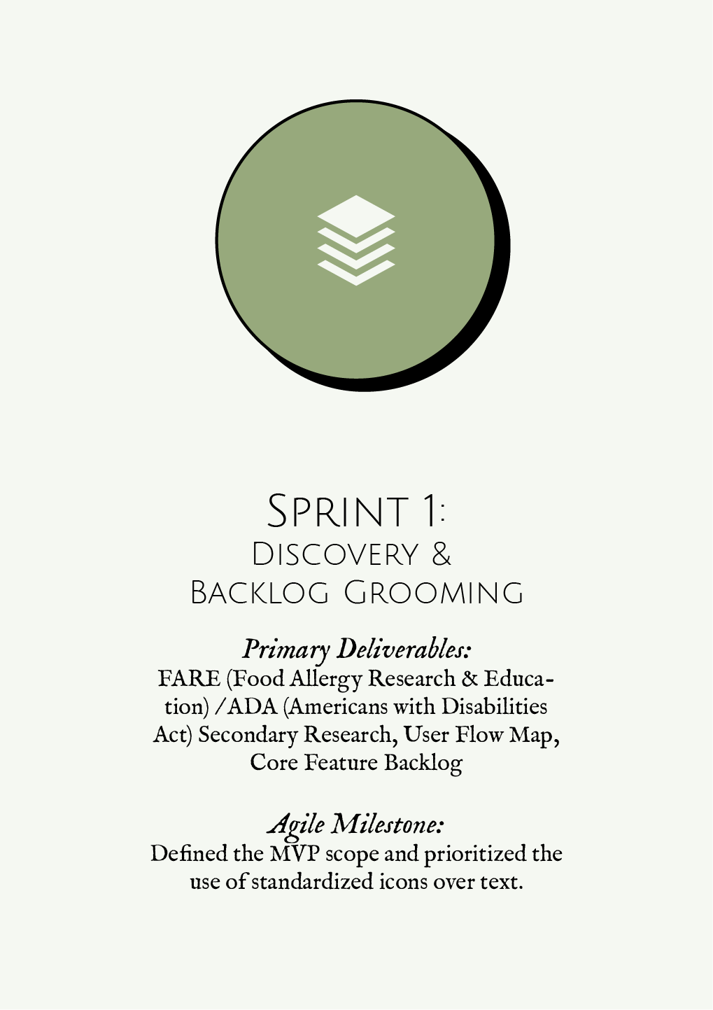
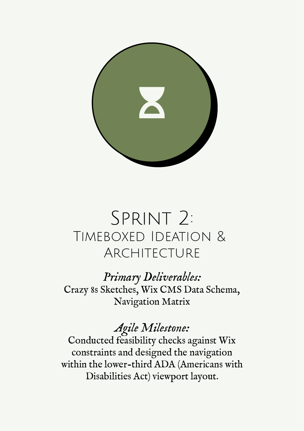
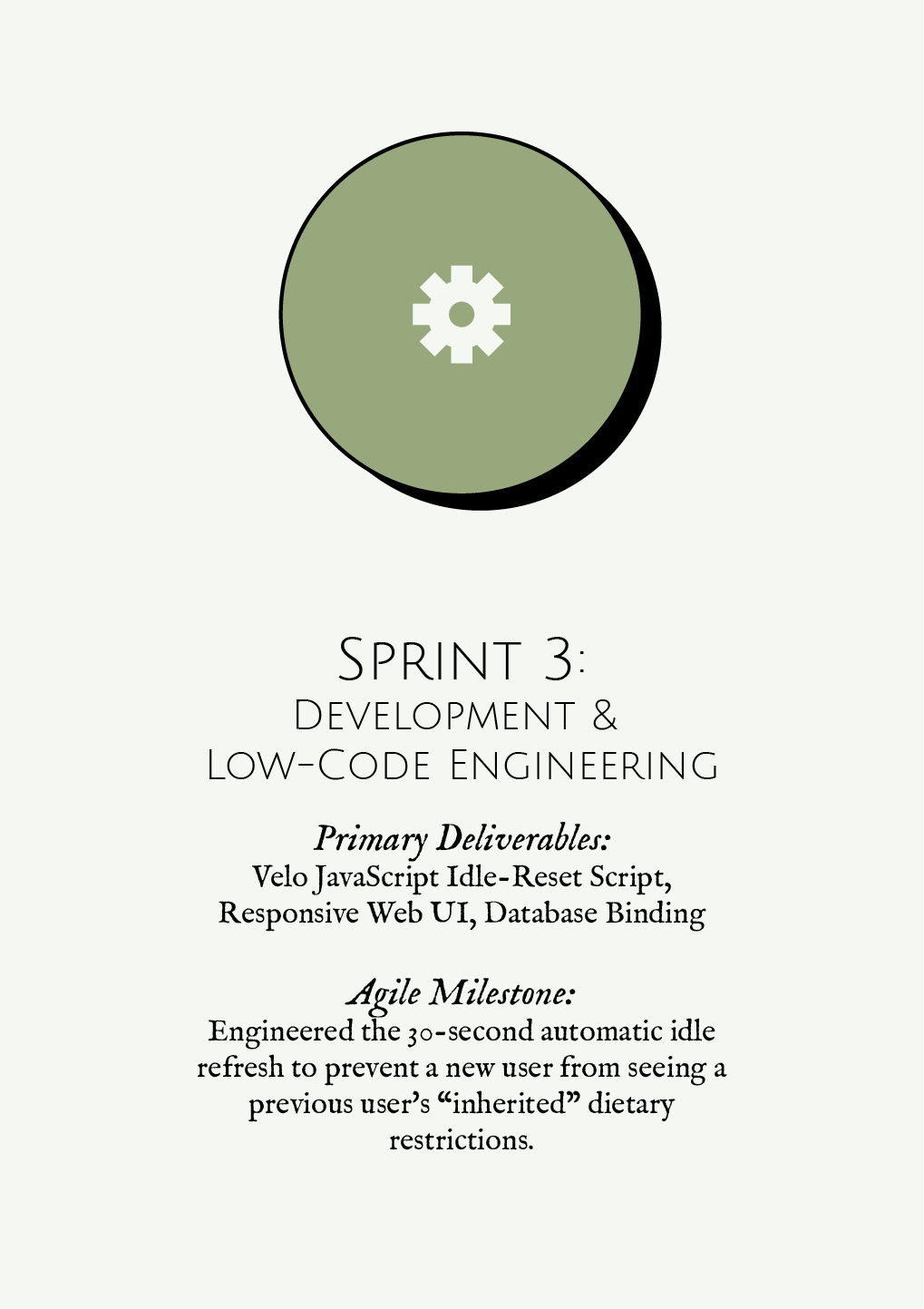
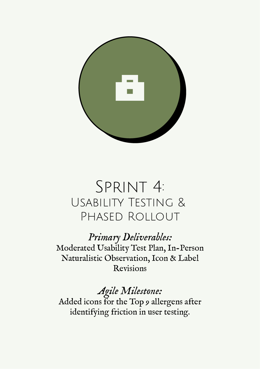
Although I was the sole designer on the project from research to implementation, I intentionally adopted Agile product development principles throughout the process.
The project was broken into multiple iterations, with each phase focused on validating assumptions, gathering feedback, and refining the experience before moving forward.
Constraints & Trade-Offs
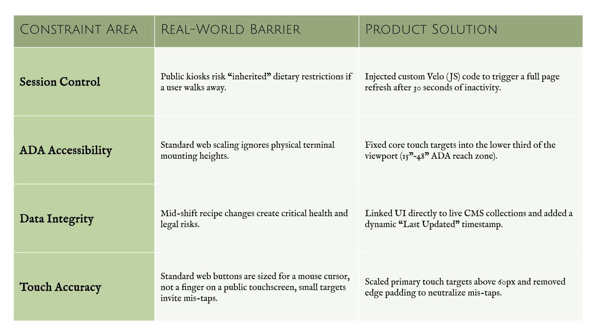
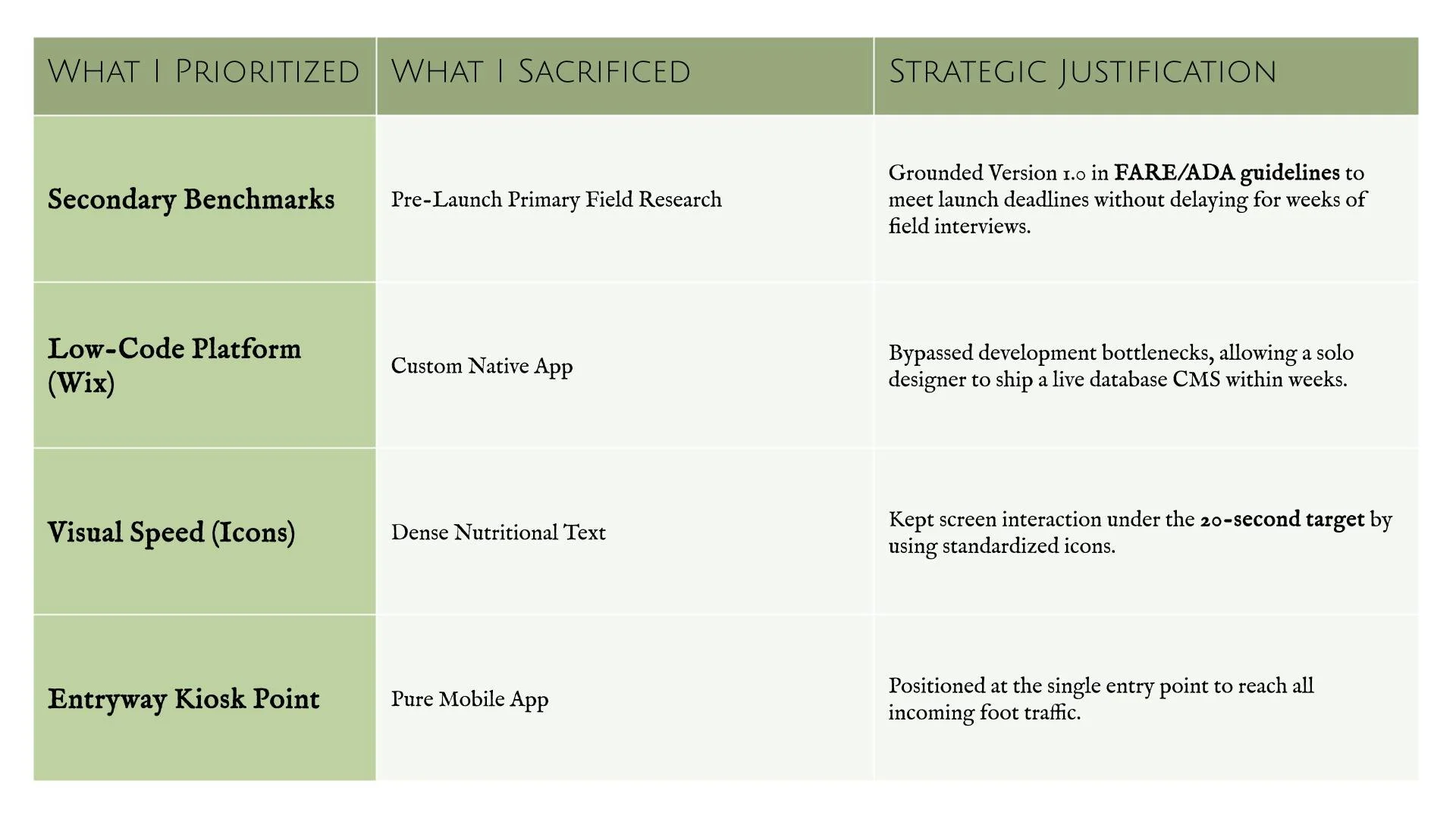
Building a safety-critical public kiosk as a solo designer required balancing technical platform limitations with real-world execution speed. To deliver an ADA-compliant “Version 1.0" on time, I treated hardware and platform constraints as strict design boundaries.
Engineering & Hardware Constraints
Product Strategy & Scope Trade-Offs
Empathizing with the Users
Foundational Research:
To navigate a compressed timeline and a small budget, I used Secondary Research to identify established pain points in campus dining and food-safety standards. This allowed me to ground the design in proven user needs without delaying the project's launch.
The secondary research methods I used are:
Competitive audits: to assess competitors' strengths and weaknesses.
Industry benchmarks: to ensure the kiosk followed ADA and FARE guidelines.
Research Insights:
1. The “Visual Language" Insight
A key takeaway from my audit was the effectiveness of standardized vegetarian/vegan icons over text. I chose to use icons for dietary restrictions (e.g. vegetarian and vegan) to facilitate the <20-second Time-on-Task.
2. The “Physical Accessibility" Insight
By reviewing ADA standards, I ensured the interface layout kept primary navigation within the “accessible reach zone” of 15” - 48” for students using wheelchairs or mobility aids.
3. The “Trust" Insight
Following FARE guidelines, I prioritized a “Last Updated” timestamp on menus to build trust and transparency regarding cross-contamination risks.
Identifying the Friction:
Problem Statement:
To help me define a clear problem statement I will use the 5 W’s and H.
The User: Students with dietary restrictions (e.g., Violet, a freshman with severe nut allergies).
The Pain Point: The uncertainty and wasted time associated with verifying ingredients during peak dining hours.
The Timing: Every time a student eats on campus, but most acutely during the 11am–2pm lunch rush, when the line is longest and the pressure to decide is highest.
The Setting: At the serving line inside Shaw University’s Willie E. Gary Dining Hall, standing in front of a dish with no visible way to check what's in it before committing to a plate.
The Goal: To replace mealtime anxiety with confidence by providing a transparent, “instant-access" information hub at the point of decision.
The Opportunity: How might we give students instant, reliable access to ingredient and allergen information at the exact moment they're deciding what to eat?
“Violet is a first year student at Shaw University with severe tree nut and peanut allergies who needs a quick, reliable way to verify daily menu ingredients because as a freshman she does not need the added stress of food-related anxiety.”
Value Proposition:
The kiosk serves as a bridge between campus dining and student safety. I designed the solution to provide:
Instant Transparency: Real-time dietary lookups for every dish on the menu.
Reliability: A “single source of truth" for residential and commuting students.
Efficiency: Reducing the “Information Gap" so students can stay informed without slowing down their day.
Minimum Viable proposition Scope (Version 1.0):
Primary Objective: Allow students to instantly search for a specific dish by name and view its nutritional breakdown.
Core Safety Feature: Utilize standardized vegetarian and vegan icons on every dish detail view to enable high-speed visual scanning (<20-second Time-on-Task).
Success Metric: Zero onboarding friction (no accounts/logins required) at the point of decision.
Ideate
The Crazy 8s Method:
To move past the most obvious solutions, I conducted a Crazy 8s sketching exercise. The goal was to challenge myself to generate eight distinct concepts for the kiosk interface in just eight minutes, focusing specifically on my target metric of <20-second Time-on-Task.
Why Crazy 8s:
By forcing a fast pace, I was able to bypass “perfectionism" and explore unconventional layouts—shifting from text-heavy lists to more visual, accessibility-first interfaces.
The Core Concepts Explored:
Out of the eight sketches, three key directions emerged as the strongest contenders for Violet’s needs:
The Search Feature: A minimalist search bar centered for speed, designed for students who know exactly what they are looking for (e.g., “Is the soup nut-free?").
The Visual Icons: A standardized set of icons for vegetarian and vegan dishes. By using these icons it allows users to quickly recognize the dietary preference for a specific dish.
Reset After Idle: A feature that prepares the kiosk for the next student in line after a certain about of time of idle.
User Flow:
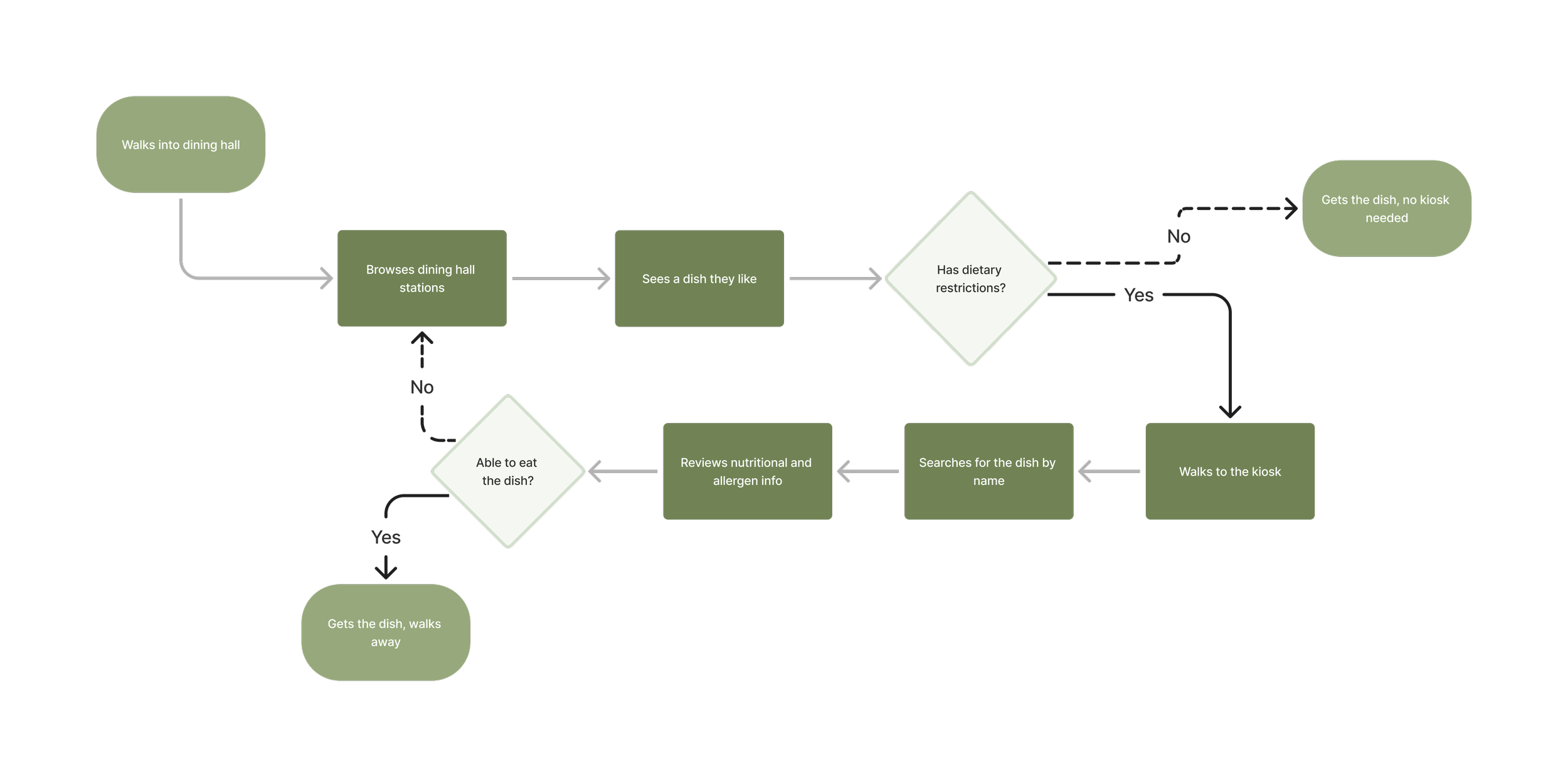
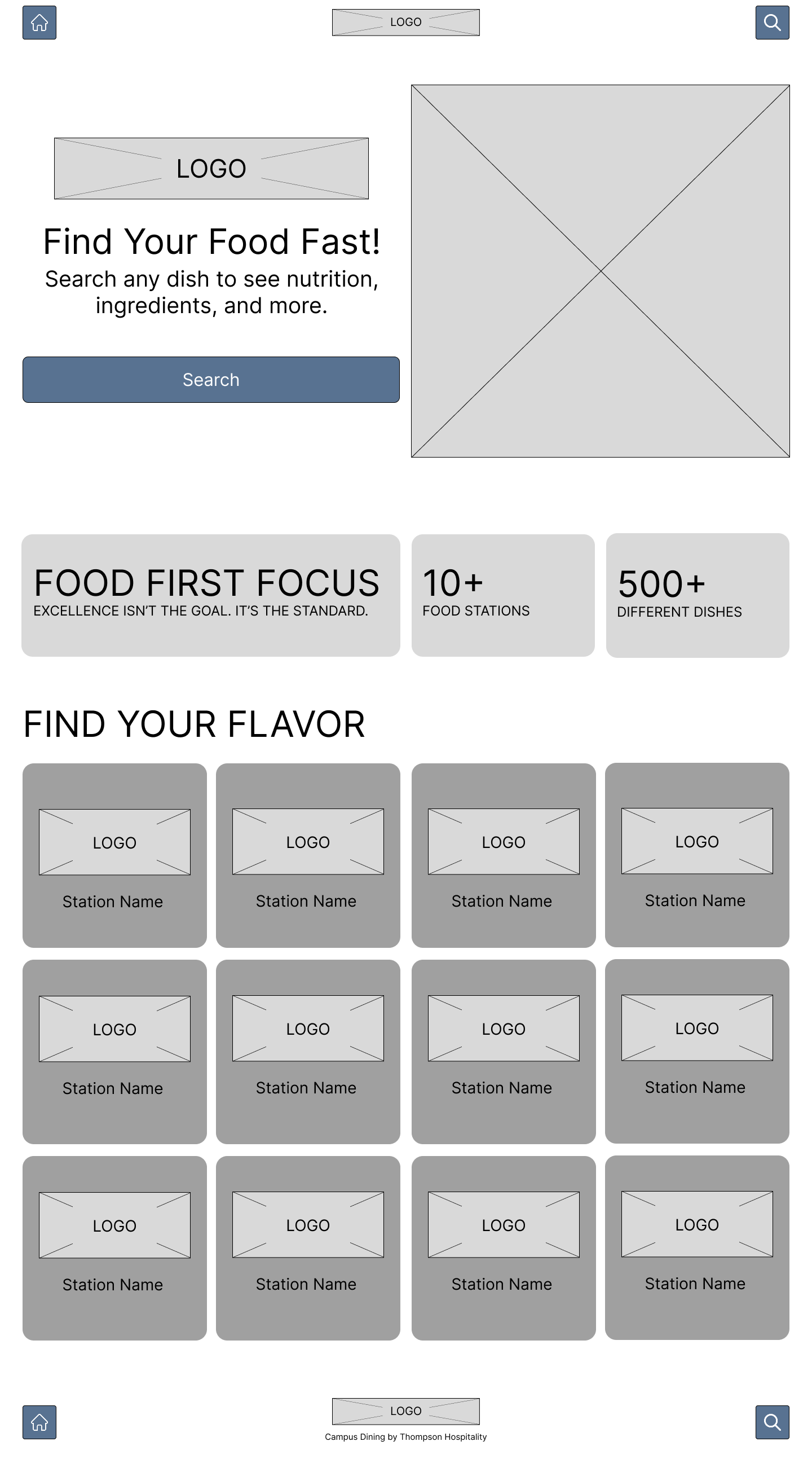
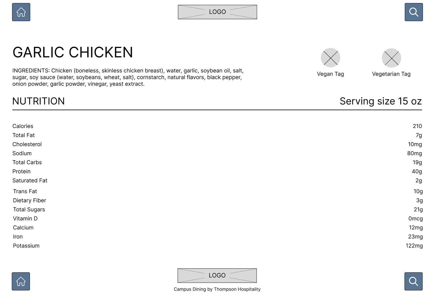
Lo-Fi Wireframes:
Using the highest-potential concepts from the Crazy 8s timebox, I transitioned into Figma to build low-fidelity wireframes. My goal during this phase was to test spatial hierarchy, touch ergonomics, and task efficiency before applying visual styling.
Build
To test the interaction flow and database integration in real-world conditions, I built a functional MVP using Wix CMS and custom Velo JavaScript. This allowed me to test live data updates, automatic idle resets, and responsive touch layouts without waiting for custom software engineering resources.
Core Prototype Mechanics Built:
Database Connection: A dynamic, searchable CMS binding that instantly updates dish information and allergen tags.
Velo Idle-Reset Logic: Custom JavaScript trigger that forces a full session reset after 30 seconds of inactivity to guarantee data safety for the next student.
Accessible Touch Targets: Primary interactions scaled above 60px and confined to the 15" – 48" ADA reach zone, keeping the interface usable for students using wheelchairs or mobility aids.
Testing & Findings
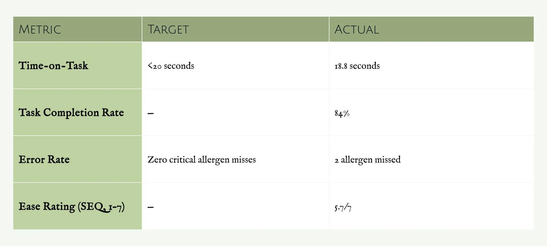
To validate the <20-second Time-on-Task target from Version 1.0, I ran mixed-methods usability testing on-site at Shaw University, combining moderated think-aloud sessions and in-person naturalistic observation during peak dining hours.
Target vs. Actual:
Moderated Testing:
6–8 students with active dietary restrictions, mirroring Violet, our core persona, worked through 5 think-aloud tasks on the physical kiosk. Tasks spanned single-dish lookups (“Find out how many calories Southern Fried Chicken has"), dish comparisons, way finding to a dish's station, and one open-ended, unscripted task.
What worked: Students were quickly able to find/identify the search button on the landing page.
What didn't: Students had a moment of confusion when dining hall station pages (e.g., “Showdown," “Top That: Salad Studio") appeared mixed into their dish search results, with no way to filter them out.
Notable quotes: “I wish I could browse strictly vegetarian dishes.” “I have no idea what’s on today’s menu." “Why are there only icons for vegetarian and vegan and the rest are in a list lower on the page.”
Naturalistic Observation:
To capture zero-guidance behavior in real time, I observed real student interactions in person from a nearby table during the same lunch window. No tasks were assigned and no interaction from me.
What I noticed: The kiosk's placement caught nearly everyone's attention, I heard multiple students say “Ooo, what's this?” or “Oh, that's new” as they walked by, and interaction was frequent throughout my observation window.
Confusion signals: I witnessed excessive scrolling on the homepage and search result page that could be a sign of confusion and not finding what they are looking for.
A moment worth noting: I witnessed 3 students walk away while the kiosk was still on the search page. This could mean that the students gave up and decided to walk away or they were just curious and playing around with the new device.
Top Findings:
1. The “Allergen Blind Spot " Finding — Severity: Critical
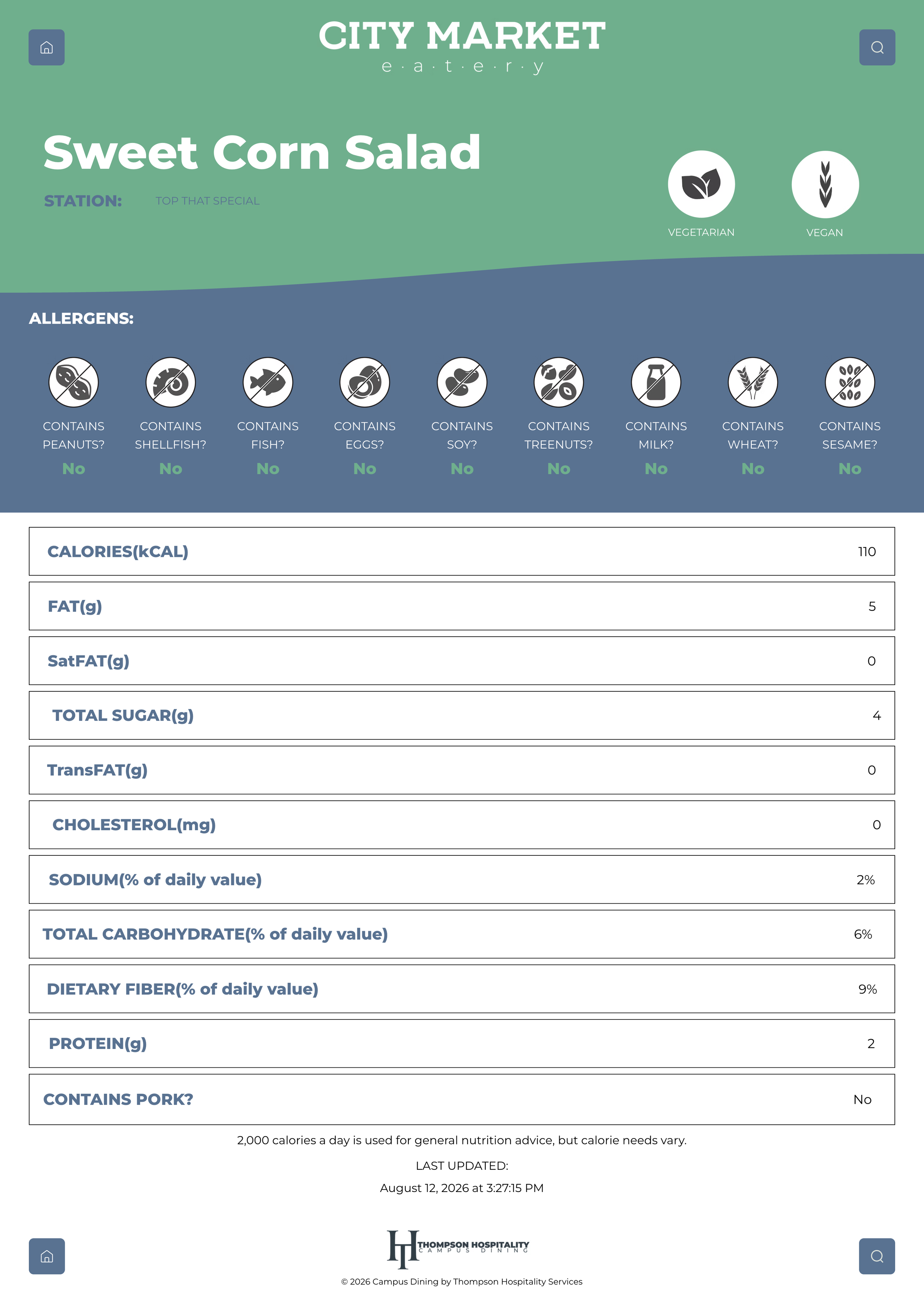
Students who saw the vegetarian and vegan icons assumed that covered the dish's full dietary profile, missing that specific allergens were listed as text further down the page. This is very likely what drove the 2 critical allergen misses in testing. I'll need to add icons for the top 9 allergens rather than relying on text alone.
2. The “Browse Paralysis" Finding — Severity: Moderate
Students currently can't browse or filter dishes at the kiosk. Search only works if they already know the dish's name. Adding a filtering feature and catalog page would let students approach the kiosk without a specific dish in mind.
3. The “Static Menu" Finding — Severity: Moderate
Some students do not know what is being served at the dining before arriving. Eventually, I need to find a way for the kiosk to display that day’s dishes. Currently it is a catalog for all dishes. This will be a very nice feature to add in the future, but I believe there are matters that need to be handled first.
4. The “Mixed Search Results" Finding — Severity: Moderate
Students were confused when dining hall station pages (e.g., “Showdown," “Top That: Salad Studio") appeared mixed into their dish search results. To avoid this confusion in the future, I will have to figure out a way to filter them out or remove these pages entirely.
What Changed:
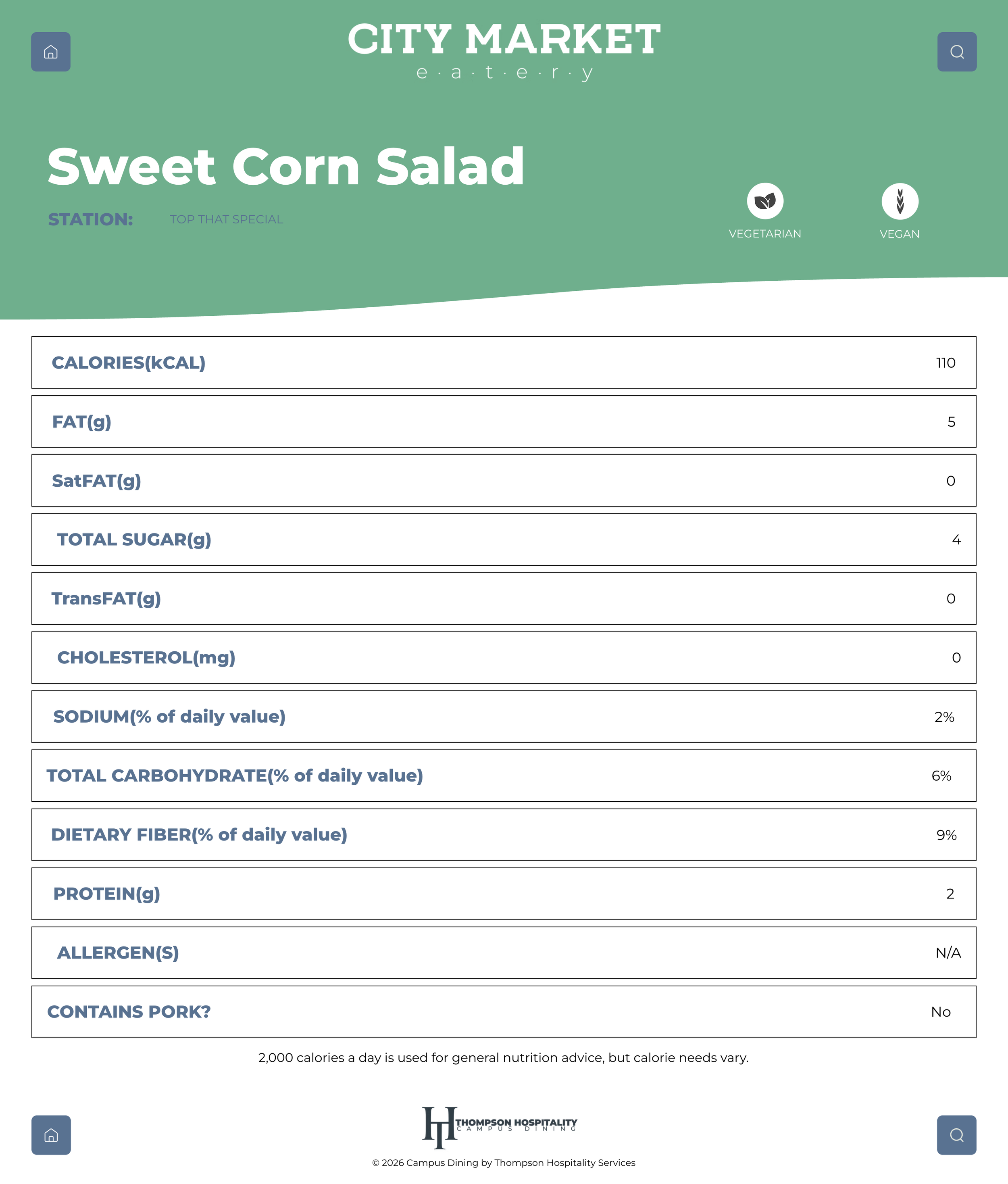
My biggest takeaway from the usability testing was the allergen icons. At first I thought that having icons for just vegetarian and vegan was enough. However, after conducting the usability testing, I gathered that having crucial information like allergens hidden on the page was a big mistake. Therefore, I added the top 9 allergens toward the top of the page.
Separately, I also added a “Last Updated” timestamp to each dish page, planned for Version 1.0 originally but missed during the initial build. It doesn't resolve any of the findings above, but it's a quick way to signal transparency and to build trust.
Before
Version 2.0 (Proposed, not built)
After
Phase 2 Outlook:
For the next iteration, I plan on adding a catalog page with the feature to allow students to filter the dishes. This will allow students to use the kiosk without already knowing what to eat. This will also mean that the dishes on the kiosk will have to match the dishes being served that day.
Version 1.0 (shipped)

Current Status & Retrospective
Current Status:
Version 1.0 is fully designed and integrated with the Wix CMS backend, enabling students to search dishes by name and immediately view nutritional data alongside visual allergen icons. The kiosk is currently live as a pilot at Shaw University's Willie E. Gary Dining Hall, with a broader rollout across Thompson Hospitality's 18-campus network beginning soon. As the pilot continues through the semester and interaction increases, I'll be able to use Wix's built-in analytics to track average session time and drop-off rate.
The kiosk is currently prepped for its next phase: a catalog page with multi-allergen and lifestyle preference filters (e.g., Vegetarian, Vegan, Top-9 Allergens).
Retrospective: Key takeaways as a Solo Designer
Designing for Physical Context is Different Than Mobile: Operating in a high-traffic entryway taught me that digital UI design is only half of the solution. Physical lighting, line bottlenecks, and ADA reach zone (15"–48") heavily dictate whether a software design succeeds in the real world.
Low-Code Doesn't Mean Low-Engineering: Working within Wix required creative problem-solving—like using custom Velo JavaScript to force idle resets—to bridge the gap between web software and dedicated kiosk hardware.
Agile Scope Control is Essential: As a solo designer managing every phase, prioritizing a strict MVP (<20-second Time-on-Task) prevented scope creep and ensured the core food-safety problem was solved first.
View Next Project!
View Next Project!
Tottenham Hotspurs: Landing Page
UI/UX | Web Design | Branding | Responsive Design