Thompson Hospitality: Nutrition Kiosk
Dining hall anxiety is a daily reality for students with dietary restrictions. To foster a more inclusive campus environment, I designed a self-service kiosk that provides instant transparency into daily menus.
Faced with a compressed timeline and limited budget mid-academic year, I focused on high-impact safety features, streamlining the design to ensure no student has to guess what is in their meal.
Project goal:
To foster an inclusive dining environment where “what’s for dinner?" isn't a stressful question. I designed this kiosk to be a reliable advocate for students with allergies, providing the transparency they need to eat with confidence.
Result:
A streamlined digital resource that empowers students to make informed, safe, and confident choices. By prioritizing a clear information hierarchy, I achieved a target Time-on-Task of <20 seconds for students to identify critical allergens or dietary triggers.
Project Type
UX Design Process | UI Design | UX Research | Wireframes | Prototypes | Usability Testing | Branding
Role:
Lead UX Designer
Start Date
05/19/2025
End Date
08/4/2025
Audience:
Students with dietary restrictions.
Tools
Figma, Adobe Creative cloud, and Wix Studio
Platform:
Physical Kiosk Interface


Project Methodology
Although I was the sole designer on the project from research to implementation, I intentionally adopted Agile product development principles throughout the process.
The project was broken into multiple iterations, with each phase focused on validating assumptions, gathering feedback, and refining the experience before moving forward.
Sprint 1: COMPLETE
Conduct secondary research
Identify user needs
Define product requirements
Sprint 2: COMPLETE
List possible constraints I may run into. e.g. operational, technical, business, human/behavior, etc.
Develop user flows
Design low-fidelity wireframes
Sprint 3: COMPLETE
Build prototype
Conduct usability testing
Prioritize improvements and identify possible trade-offs.
Sprint 4: IN-PROGRESS
Launch MVP kiosk experience
Collect student feedback
Identify future enhancements
This iterative approach allowed the product to evolve based on user insights rather than assumptions.
Empathizing with the Users
Foundational Research:
To navigate a compressed timeline and a small budget, I utilized Secondary Research to identify established pain points in campus dining and food-safety standards. This allowed me to ground the design in proven user needs without delaying the project's launch.
Here are the methods I used during this phase:
Competitive Audit:
An overview of your competitors strengths and weaknesses. During this audit I made sure to look at our direct competitors and indirect competitors. A competitive audit of grocery kiosks revealed that users identify safety icons 3x faster than text descriptions. I also analyzed direct campus competitors and indirect leaders (like medical and grocery apps) to identify strengths in high-speed data visualization.
Industry Benchmarks:
To ensure the kiosk was both inclusive and reliable, I anchored the interface in ADA (Americans with Disabilities Act) and FARE (Food Allergy Research & Education) guidelines. This involved prioritizing high-contrast visual identifiers for the “Top 9" allergens and ensuring that the most critical safety filters were placed within an accessible physical reach for every student, regardless of height or mobility.
Research Insights:
1. The “Visual Language" Insight
A key takeaway from my audit was the effectiveness of standardized iconography over text. I chose to use universal icons for the ‘Top 9' allergens to facilitate the <20s identification goal.
2. The “Physical Accessibility" Insight
By reviewing ADA standards, I ensured the interface layout kept primary navigation within the ‘accessible reach zone' for students using wheelchairs or mobility aids.
3. The “Trust" Insight
Following FARE guidelines, I prioritized a “Last Updated” timestamp on menus to build trust and transparency regarding cross-contamination risks.
Identifying the Friction:
Problem Statement:
A problem statement is a clear description of the user’s needs. I want to make sure I have a strong problem statement by making sure it is human-centered, broad enough for creative freedom, but narrow enough to be solved by a practical design solution.
To help me define a clear problem statement I will use the 5 W’s and H.
The User: Students with dietary restrictions (e.g., Violet, a freshman with severe nut allergies).
The Pain Point: The uncertainty and time-loss associated with verifying ingredients during peak dining hours.
The Goal: To replace mealtime anxiety with confidence by providing a transparent, “instant-access" information hub at the point of decision.
Violet is a first year student at Hampton University with severe tree nut and peanut allergies who needs a quick, reliable way to verify daily menu ingredients because as a freshmen she does not need the added stress of food-related anxiety.
Value Proposition:
The kiosk serves as a bridge between campus dining and student safety. I designed the solution to provide:
Instant Transparency: Real-time dietary lookups for every dish on the menu.
Reliability: A “single source of truth" for residential and commuting students.
Efficiency: Reducing the “Information Gap" so students can stay informed without slowing down their day.
Constraints
1. Session Control & The "Clean Slate" Risk
The Constraint: Public kiosks require an automatic timeout reset. If a student walks away mid-use, the next user might inherit someone else’s dangerous allergy filters. Wix lacks out-of-the-box idle-timeout page refreshes.
The Product Solution: I injected custom Velo (Wix JavaScript) code to monitor inactivity. The system forces a full page refresh after 30 seconds of zero touch interaction, guaranteeing a clean slate for the next student.
2. Hardware Ergonomics vs. Web Responsiveness
The Constraint: Standard web layouts scale dynamically based on screen resolution, completely ignoring physical height constraints or hardware mounting positions.
The Product Solution: To guarantee compliance with ADA reach-zone standards (15" to 48" from the floor), I locked the layout matrix. Primary navigation is also available in the lower third of the viewport so they remain fully accessible to wheelchair users.
3. Data Latency & Menu Integrity
The Constraint: Dining hall menus are highly dynamic due to mid-shift ingredient substitutions or supply issues. A static or slow-updating database introduces a critical health risk.
The Product Solution: To prevent data latency from compromising safety, I will meet with stakeholders at least twice a month to ensure all information is up-to-date. I prioritized a prominent “Last Updated" timestamp pulled dynamically from the CMS dataset, providing instant transparency and building user trust.
4. Public Gesture Constraints
The Constraint: Public touchscreens are prone to accidental inputs. Web browsers natively permit pinching, zooming, and edge-swiping, which would break the immersive kiosk experience.
The Product Solution: I modified the layout geometry by scaling all primary touch targets above 60px and eliminating tight edge padding. This design language acts as a physical buffer, completely neutralizing native browser gestures.
Ideate
The Crazy 8s Method:
To move past the most obvious solutions, I conducted a Crazy 8s sketching exercise. The goal was to challenge myself to generate eight distinct concepts for the kiosk interface in just eight minutes, focusing specifically on my target metric of <20 seconds time-on-task.
Why Crazy 8s?:
By forcing a fast pace, I was able to bypass “perfectionism" and explore unconventional layouts—shifting from text-heavy lists to more visual, accessibility-first interfaces.
The Core Concepts Explored:
Out of the eight sketches, three key directions emerged as the strongest contenders for Violet’s needs:
The “Safety-First" Toggle: A layout dominated by large allergen icons at the top, where selecting an icon instantly “greys out" unsafe dishes.
The “Search & Filter" Hybrid: A minimalist search bar centered for speed, designed for students who know exactly what they are looking for (e.g., “Is the soup nut-free?").
The “Visual Tray" Map: A spatial view of the dining hall stations, color-coded by safety, allowing students to plan their route before they even pick up a plate.
The Core Concepts Explored:
Following the sketching session, I evaluated the ideas based on User Impact (Safety) vs. Technical Feasibility (Data availability). I decided to move forward with a Safety-First Filter system because it directly addressed the "Allergy Anxiety" identified in my research.
Key features prioritized for the prototype:
Persistent Filter Bar: Allergen toggles that stay visible at all times.
High-Contrast Iconography: To ensure recognition in 1 second or less.
Reset After Idle: A feature that prepares the kiosk for the next student in line after a certain about of time of idle.
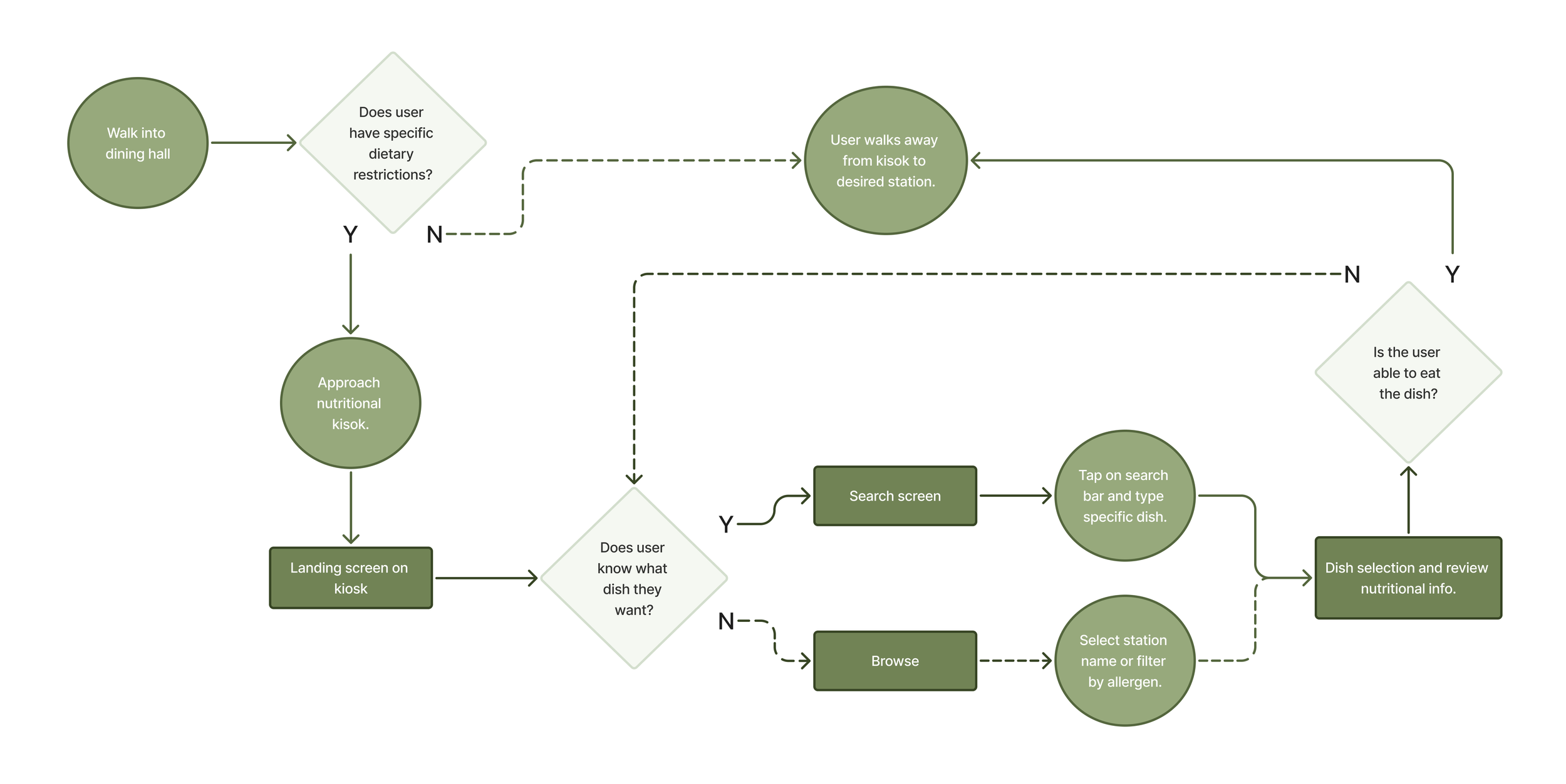
User Flow:
Trade-Offs
Designing under a compressed timeline and a small budget required making deliberate product choices. To deliver a safe, compliant kiosk on time, I balanced absolute perfection against immediate, real-world utility.
1. Launch Speed vs. Deep User Research
The Trade-Off: I substituted custom user interviews and field tests for rigorous Secondary Research (ADA and FARE guidelines).
The Justification: Extensive primary research would have delayed deployment past the target due date. Grounding the design in established legal and medical safety benchmarks allowed me to ship a compliant “Version 1.0" immediately, deferring field testing to post-launch evaluation.
2. Low-Code Agility vs. Native Code Control
The Trade-Off: I selected Wix for rapid, database-driven deployment instead of developing a Custom Native Application.
The Justification: A custom app required engineering resources and a multi-month lifecycle. While Wix limited deep hardware control, it is great for a solo designer, like me, to launch a functional, easy-to-update CMS menu system within weeks.
3. Visual Speed vs. Information Density
The Trade-Off: I prioritized high-speed iconography (large allergen symbols) over displaying dense nutritional text on the main feed.
The Justification: Overloading the primary screen with text causes cognitive friction and creates a bottleneck at the entryway. To protect the <20-second time-on-task goal, I nested exhaustive ingredient breakdowns inside optional, tap-to-expand modals.
4. Entrance Kiosk vs. Mobile App
The Trade-Off: I deployed a physical kiosk at the entrance rather than a standard mobile app.
The Justification: Mobile apps require downloads, account creation, and behavioral changes. The physical kiosk intercepts 100% of foot traffic at the exact point of decision. I bridged the gap by adding a terminal QR code handoff, allowing users to scan and walk away with a mobile “safe menu."
Prototype
The Safety-First Interface:
By keeping the problem statement and goal statement in mind, I will create user flows, wire-frames, low-fidelity and high-fidelity prototypes.
Notes:
User Flows:
A user flow is the path taken by a typical user on an app or a website, so they can complete a task from start to finish. User flows do not contain full content but instead use shapes to show how a user moves through our website. Below you can see the shapes I used for my user flow.
Collaboration & Implementation
While I served as the only designer on the project, I collaborated closely with dining operations stakeholders to understand business requirements and validate assumptions throughout development.
Implementation required balancing user needs with operational constraints, including nutrition database structures, kiosk limitations, and maintenance considerations.
Throughout the project, design decisions were continuously evaluated against technical feasibility, ensuring that proposed solutions could be implemented effectively while maintaining a seamless user experience.
This process strengthened my ability to think beyond interface design and consider the broader product ecosystem, operational workflows, and long-term scalability.
Testing
To evaluate the interface against the core <20-second time-on-task goal, I structured a mixed-methods usability testing plan optimized for a high-traffic, physical dining hall environment.
The Testing Methodology
Target Users: 5 students with active dietary restrictions (allergies, vegan, gluten-free) to mirror our core persona, Violet.
The Setup: A tablet mounted at eye level inside the dining hall entrance to simulate the physical kiosk hardware constraints.
The Task: "Locate today's lunch menu, filter out your specific dietary restrictions, and identify one safe station to eat at."
Key Metrics Tracked
Time-on-Task (Efficiency): Can the user complete the safety check in under 20 seconds?
Error Rate (Safety): Do users accidentally overlook an allergen warning or pick an unsafe dish?
System Usability Scale (SUS): A post-test 10-question survey to measure perceived ease of use.
Simulated Findings & UX Iterations
By running preliminary validation passes, I identified two critical friction points that required immediate design iterations before final handoff.
Friction 1: Icon Misinterpretation
The Issue: During rapid scanning, the "Tree Nut" icon (represented by an acorn) was occasionally confused with a general seed or grain icon, increasing cognitive load.
The Iteration: Added prominent, high-contrast text labels directly beneath every icon in the "Top 9" filter bar. Relying on text + icon eliminated ambiguity and met WCAG accessibility rules.
Friction 2: The "Hidden" QR Code Handoff
The Issue: Users successfully filtered their menus but stood at the kiosk too long to read individual dishes, creating a hypothetical bottleneck at the entryway. They missed the small mobile QR handoff.
The Iteration: Enlarged the QR code container and anchored it to a persistent floating button labeled "Take this menu to go." This successfully triggered the mobile handoff, clearing the kiosk for the next user.
Final Thoughts
Outcome:
Three months into the semester and four months after launch, I have seen some great results.
For starters the exit rate, how often visitors leave the site after viewing a certain page, of the site has been great. The high priority pages such as the menus, locations, and events page on the website has a exit rate of 92% or above. Suggesting users were successfully completing their primary tasks.
The redesign also lowered the site’s bounce rate from 66% to 58%, indicating stronger engagement and improved navigation throughout the experience.
Takeaways:
Going through this rigorous UX design process alone, I was able to learn a few things. First thing I learned was the importance of doing the research as early as possible in the design process. The research is the backbone and the driving force of your design decisions and to do that is to truly understanding your users and their needs. I also found the importance of making sure to remove any bias during the user interviews. As this was the first time conducting user interviews, this is something I struggled during the first few interviews but after making a few adjustments I believe I was able to conduct unbiased interviews. I was able to do this by choosing my words carefully, avoiding specific language and limiting guidance I gave to the users.
Although the process was challenging and time-intensive, seeing the final experience and measurable outcomes made it incredibly rewarding.
View Next Project!
View Next Project!
Tottenham Hotspurs: Landing Page
UI/UX | Web Design | Branding | Responsive Design