Thompson Hospitality UI/UX Project
When I first started my career at Thompson Hospitatliy, I mainly focused on just the design of our websites and making sure it looked clean and professional. However, I knew I could be doing more and making research based design choices to improve the function and experience of our websites. I created this project plan, presented this plan to my manager and executed it from start to finish.
Project goal:
Fuller understanding the user pain point, needs, and user-intent on our campus dining website. Understand how the current user navigates the site and to determine how to streamline the information architecture in a way that is useful and effective.
Audience:
College Students
Measurable Target (KPIs):
Lower bounce rate by at least 10%.
Project Type
UI Design | UX Research | Wireframes | Prototypes | Web Design | Branding
Start Date
05/19/2025
End Date
08/4/2025
Tools
Figma, Adobe Creative cloud, and Wix Studio

Step 1: Empathize
Start Date
05/19/2025
End Date
05/26/2025
Desired Outcome:
Use user interviews and surveys to learn more about the users, their problems, their needs and their wants. Using the findings from interviews/surveys, create user personas, user stories and user journey maps.
Notes:
I will go to one of our client schools to conduct 1-on-1 interviews and surveys. Hampton University or Norfolk State University will be the ideal school because they get the most traffic on their website every month. During lunch or dinner hours, I will go up to students and ask if they have time for an interview. If they are in a rush, I will have a qr code for the survey for them to fill out quickly.
Using 1-on-1 interviews, surveys, and website analytics provided by our website platform, we will fully understand our user and any problems they may have. Having a set problem to solve going into this project will hold me back. The emphasis on this step is discovery rather than confirming problems that I already suspect are there. It is important to go into this research phase with an open mind and to find any problems the user may have that we did not think about.
UX Research Plan:
The plan is to use 1-on-1 user interviews, surveys, and website analytics for research. Website analytics will be used to measure progress and KPIs. User interviews will allow us to understand the user, know what they’re thinking and get insight on user needs and expectations. Students can be very busy so surveys will be used instead of interviews for students that are too busy to sit down and talk. An incentive will help ensure the students complete the survey.
When I am conducting the user interviews, it is important for me to make it feel like a natural conversation. To be effective during this step I need to make sure the questions are relevant, open-minded, clear, neutral and designed for follow up. I'll use the questions as a guide and not as a script. Asking open-ended questions will be key.
Field Study/User Interview Questions:
Name and year?
How long have you had a dining plan?
Did you know what was on the menu today?
Do you know how to find out what's on the menu tomorrow?
How often do you visit the campus dining site?
What specific information are you looking for when visiting the campus dining site?
What was your initial impression about the campus dining site?
Is there anything missing from the site that you were expecting?
What are the biggest pain points of the website? Pain points on a website are areas that can cause frustration or difficulty while using the website.
What device do you typically use when visiting the site? Phone, laptop, tablet or other.
User Personas:
User personas are fictional but realistic representations of key user types, based on patterns and insights discovered during user interviews and surveys. Each persona reflects shared goals, motivations, and challenges of a broader user group. They play an essential role in the design process by helping us empathize with users, understand their behaviors, and make informed decisions that better meet real user needs. Below are a couple of user personas I created after meeting with so many different students.
Above each persona is their user story! User stories are a fictional one-sentence story told from the personas POV to inspire and inform design decisions. It helps us prioritize design goals by determining the most critical user need and unites the team around a clear objective.
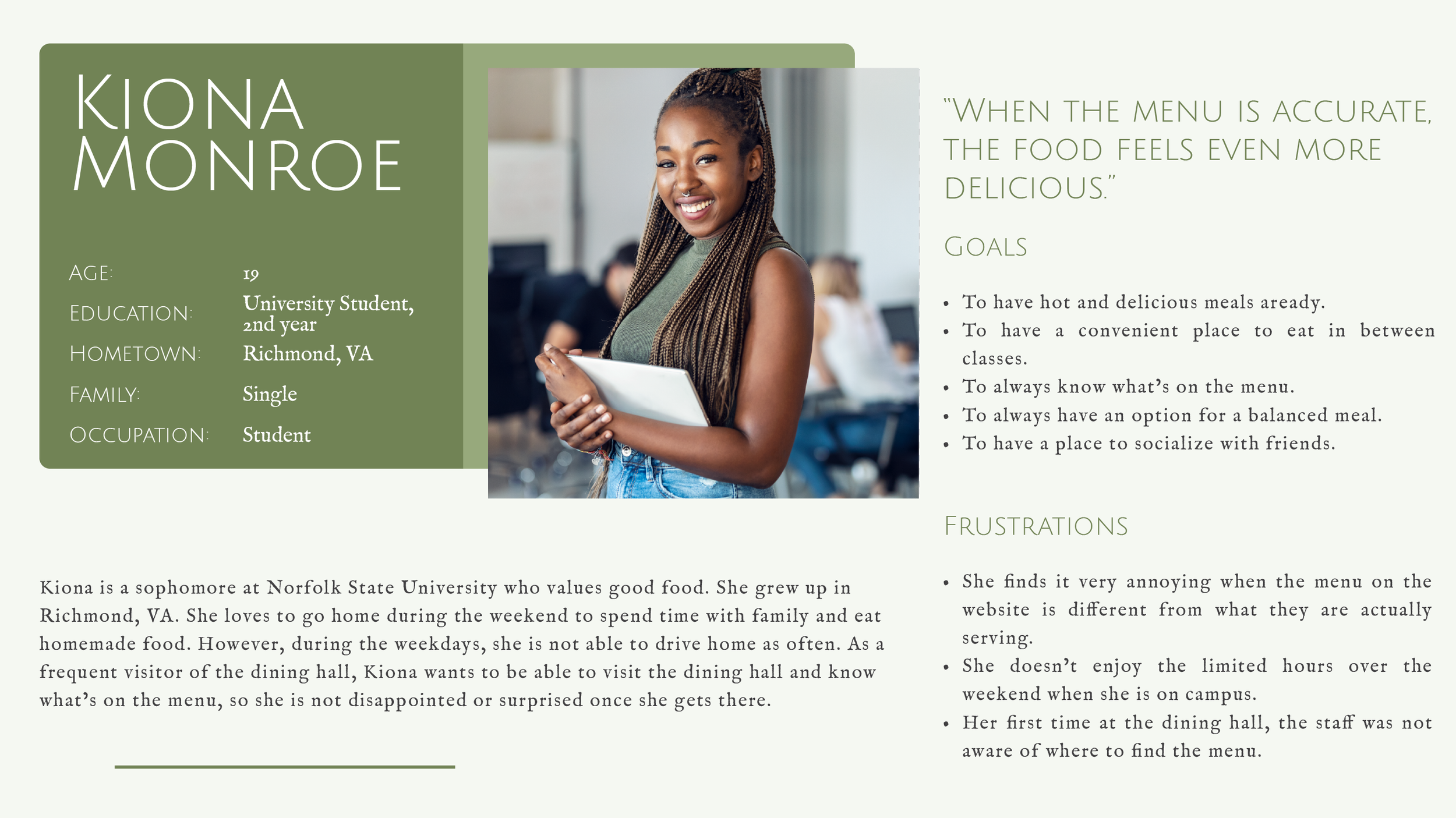
“As a frequent visitor of the dining hall, I want to be able to visit the dining hall and know what's on the menu, so I won't get disappointed or surprised once I get there.”

“As a busy junior year student, I want to be able to quickly navigate the website to find the menu and hours of all dining locations on campus, so I can study more.”

“As a commuter graduate student, I want to be able to find the location and hours of dining locations on campus on my phone, so I can quickly find my lunch for the day.”
User Journey Map:
User journey maps are a series of experiences a user has as they achieve a specific goal. I have created a user journey map off of Zariah Norman’s persona. Journey maps allows me to highlight new pain points and identify improvement opportunities in the design.
Step 2: Define
Start Date
05/26/2025
End Date
06/02/2025
Desired Outcome:
Using the information gathered from the empathize step, clearly define the problem statement, hypothesis statement, and value proposition.
Notes:
Problem Statement:
A problem statement is a clear description of the user’s needs. I want to make sure I have a strong problem statement by making sure it is human-centered, broad enough for creative freedom, but narrow enough to be solved by a practical design solution.
To help me define a clear problem statement I will use the 5 W’s and H.
Who: NSU students that have a meal plan are experiencing this problem.
What: The pain point that I am trying to solve is that the current dining website is too confusing and hard to navigate.
Where: The user is in the classroom, outside walking on campus, or at their dorm/apartment when they’re using the website.
When: This problem occurs to students in between class
Why: This problem is important because it directly impacts their daily routines, convenience and overall dining experience.
How: By using this website, students will be able to access daily information such as menus, locations, and hours. They will also be able to check any dietary information.
Zariah is a busy 3rd year student at Norfolk State University who needs to be able to quickly and easily check dining location, hours, and menus on the go because he would rather spend his time studying for his degree.
Hypothesis Statement:
A hypothesis statement is an educated guess about what you think the solution to a design problem might be. I want to make sure my hypothesis statement communicates a practical design solution to the need in the problem statement.
If Zariah can access location hours in a couple of seconds, then he will be able to plan the rest of his day accordingly.
If Kiona can go to the dining hall and not be surprised at what is being served, then she will be a lot happier with her dining experience.
Value Proposition:
A value proposition summarizes why a consumer/user should use a product/service. In this case, why students should be visiting their campus dining website. A value proposition needs to be short, clear and to-the-point.
While developing my value proposition, I kept two key questions in mind: What does my product do, and why should the users care?
Allows students to quickly plan meals. Daily menus, hours, and location all in one place.
Always stay informed. Real time updates of any menu changes, closures or special events.
Convenient dining options for residential and commuting students.
Provide transparent communication and information to students.
Step 3: Ideate
Start Date
06/02/2025
End Date
06/09/2025
Desired Outcome:
Ideate a broad set of ideas without judging them or evaluating them. No such thing as a bad idea. Create a clear goal statement and conduct a competitive audit.
Notes:
As I am the only UX designer on my team, I was able to gather a diverse group of people with different backgrounds. Our group had two graphic designers, a marketing specialist, and an operational specialist.
Ideally, I would have liked to do this brainstorming session in a creative environment, but because we all work remotely, our best option was to meet on Teams. This allowed us to save time and money.
After 30 minutes of brainstorming out loud here were some of the ideas that we came up with.
Brainstorming:
Pop-up that asks what they’re doing on the website and directs them to the correct page.
Place QR codes around the dining hall that sends users to the website.
Have a contest about finding things within the website to have users get used to it.
Updating our navigation bar/sitemap.
Just have one page with only hours, locations, and menus.
Remove all unnecessary pages or pages that are not as popular.
Buttons on the homepage that leads to the most popular pages on the website.
Redesign the footer to have important links in it.
Create a reward system so every time a user visits the website, they get points to use for coupons for free food.
Have a digital sign that displays the menus at the entrance of the dining hall.
Have three pages: home, locations and menus, and contact us page.
Have our link added to all our social media platforms.
Add a “shortcut” button in the nav that goes to the most popular page.
Post a video on our social media walking through our website.
Create one big website. This website will have a main homepage that will direct users to the correct campus they are looking for. It will contain some kind of search bar or dropdown with all campuses.
Every time a new user visits our site, walk through the website letting them know where everything is located.
Evaluating Ideas:
After brainstorming out loud without judging or evaluating them, our team took a quick break. This break is important so that we are able to reset ourselves and start clean. During the evaluation of these ideas, it is important to keep in mind if the idea is technically possible to build, best at solving the user problem and financially beneficial for us. With this in mind, the ideas that we liked the most are the following:
Updating our navigation bar/sitemap.
Buttons on the homepage that leads to the most popular pages on the website.
Add a “shortcut” button in the nav that goes to the most popular page.
Create one big website. This website will have a main homepage that will direct users to the correct campus they are looking for. It will contain some kind of search bar or dropdown with all campuses.
Goal Statement:
A product goal statement is one to two sentences that describes a product and its benefits to the user. Using the problem statement that I came up with in the previous phase will help me come up with a strong goal statement. A strong goal statement should help me create the ideal solution for my designs.
Our campus dining website will allow users to quickly find daily information like menus, hours, and locations, which will affect NSU students with meal plans by allowing them to plan accordingly with their educational and social plans. We will measure effectiveness by monitoring the bounce rate of the website. We can measure this by using the website analytics feature.
Competitive Audit:
A competitive audit is an overview of our competitors strengths and weaknesses. Audits will allow us to identify our key competitors, review their product and understand how they position themselves in the market.
Please view the link below to take a look at my competitive audit!
Competitive Audit Report:
Competitive audit goal(s)
Compare how Thompson Hospitality’s competitors display their information (specifically menus, hours & locations) on their websites.
Who are our key competitors?
Aramark - Direct competitor
Sodexo - Direct competitor
Chartwells Higher Education - Direct competitor
MealMe - Indirect competitor
What are the type and quality of competitors’ products?
Most of our competitors’ website has a dedicated page with all dining locations, along with the ability to filter locations.
Along with the location’s information (i.e. Hours and address) they have the menus right next to it.
Also, after viewing our competitors’ website, I thought that their navigation and header were a lot more organized than ours.
How do competitors position themselves in the market?
A lot of these places have similar value propositions. Customized campaign for every organization, sustainable food options, and passionate employees that love serving.
I believe this is what sets us apart. We target HBCU’s because we are one of the largest minority black owned companies. Therefore, we understand their culture and their food better than anyone else.
How do competitors talk about themselves?
They are the biggest higher education hospitality company. They use sustainable food and products at each organization. Each meal is curated with love and passion from their employees.
Competitors’ strengths
Very organized navigation and header.
The shortcut buttons directly in the header.
How they display their locations.
The ability to filter out all the closed locations.
How they display their menus.How their events can be added directly to your calendar app.
The embedded social media feed on the home page.
Competitors’ weaknesses
Very low quality photos throughout the site.
Very dull colors with zero to none branding.
Cluttered homepage
Cluttered footer
Opportunities
Make sure to add photos of students that are high quality or up-to-date stock photos.
Use bright colors that warms the heart of anyone that goes on our website.
We can use the competitors’ strengths as inspiration for our new website.
How Might We…
I converted the Problem Statements into actionable ‘how might we’ statements to help keep me on track and focused on the main pain points.
How might we streamline the users journey through our campus dining website.
How might we allow students to find the menus quickly on the website.
How might we keep our users on track to find the information they need on our campus dining website.
Step 4: Prototype
Start Date
06/16/2025
End Date
06/29/2025
Desired Outcome:
By keeping the problem statement and goal statement in mind, I will create user flows, wire-frames, low-fidelity and high-fidelity prototypes.
Notes:
User Flows:
A user flow is the path taken by a typical user on an app or a website, so they can complete a task from start to finish. User flows do not contain full content but instead use shapes to show how a user moves through our website. Below you can see the shapes I used for my user flow.

For an effective user flow I will need to determine the following; what actions will the user take, what decisions will the user make, and what screens will the user experience after making decisions or actions. Keeping this in mind, you can view the user flow I created below.
Wireframes:
A wireframe is basic outline of a digital experience. There are multiple purposes and benefits of wireframes.
Purpose of wireframe:
Establishes basic structure.
Highlights the intended functions.
Saves time and resources.
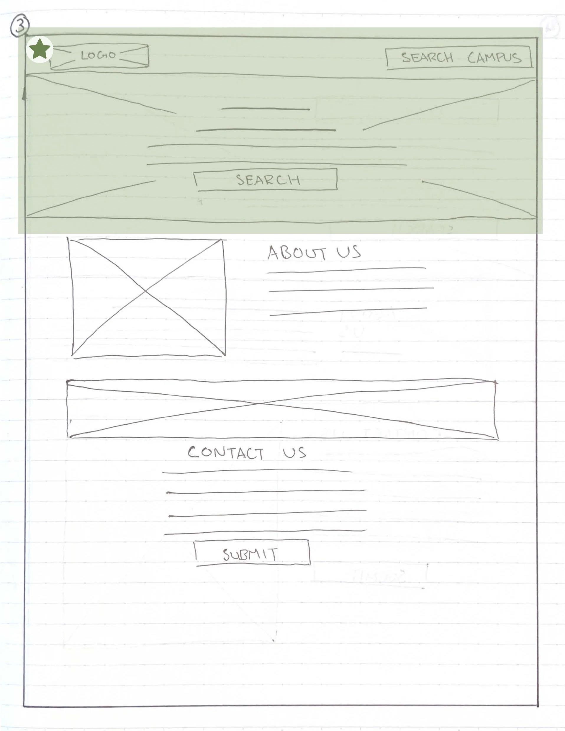
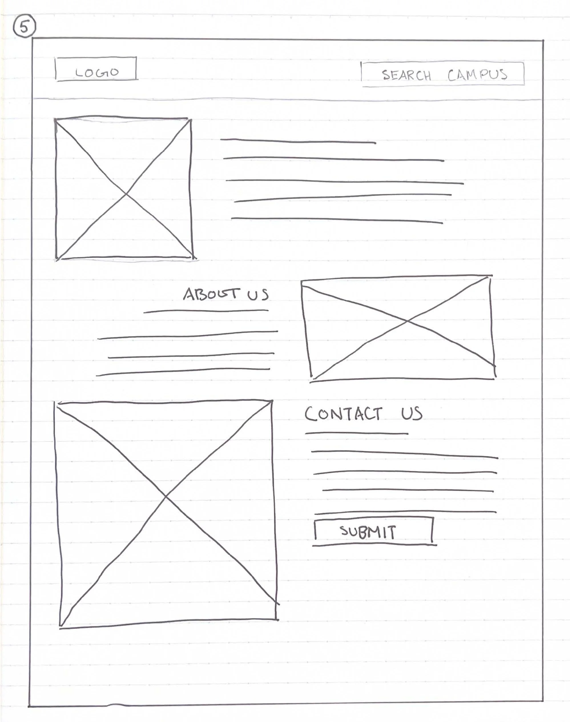
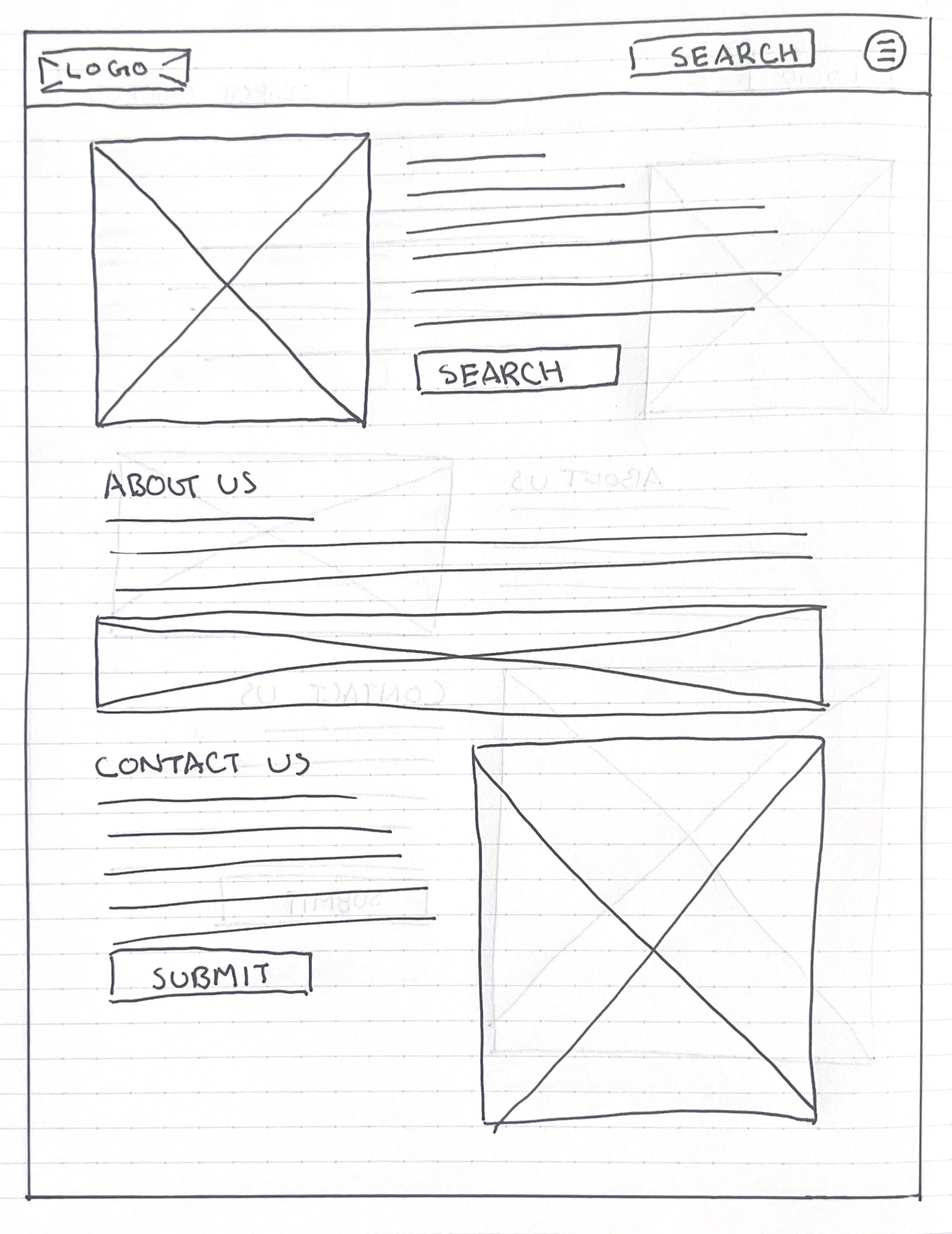
Paper Wireframes:
I designed five paper wireframes for our landing page and highlighted elements I liked from each. The first thing I did before designing my paper wireframes was make a list of elements to include in the wireframe. For this page, here are the elements I knew I wanted to add: Search bar/dropdown, logo, images, header & content, contact us form, and a quick about us section. You can view the paper wireframes below.
Benefits of wireframe:
Inform the elements to include in your design.
Catches problems early.
Gets us to focus on structure. Not color, content or photos.
Saves time and effort.
Allows us to iterate quickly.

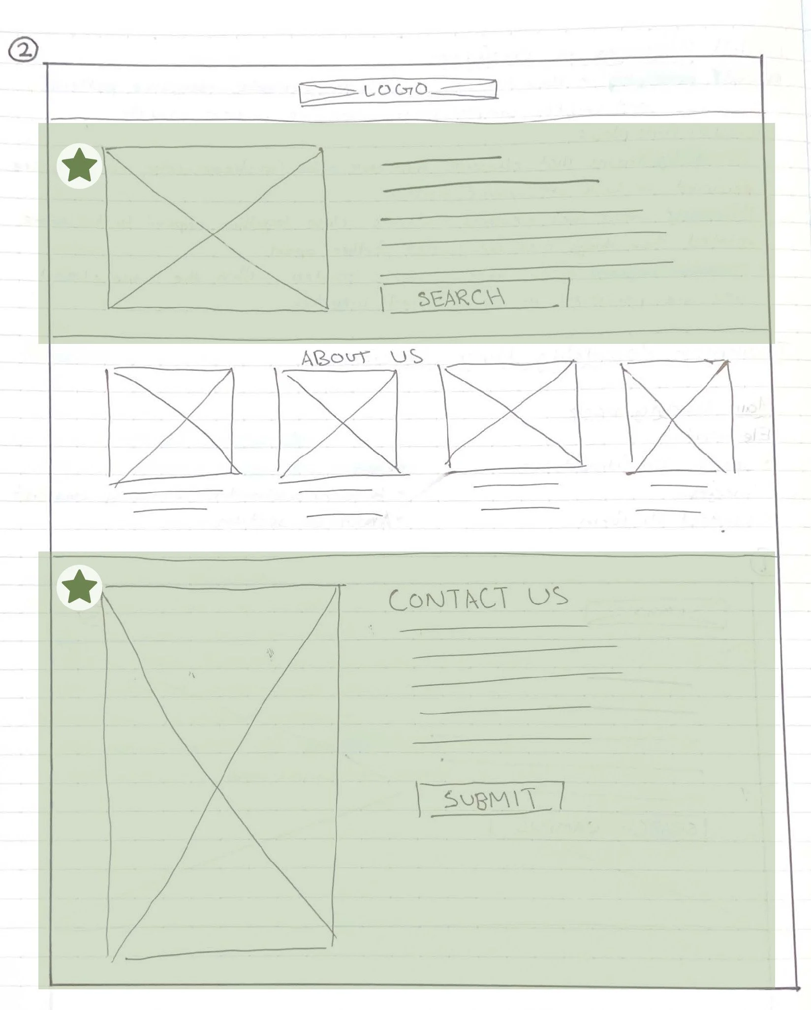
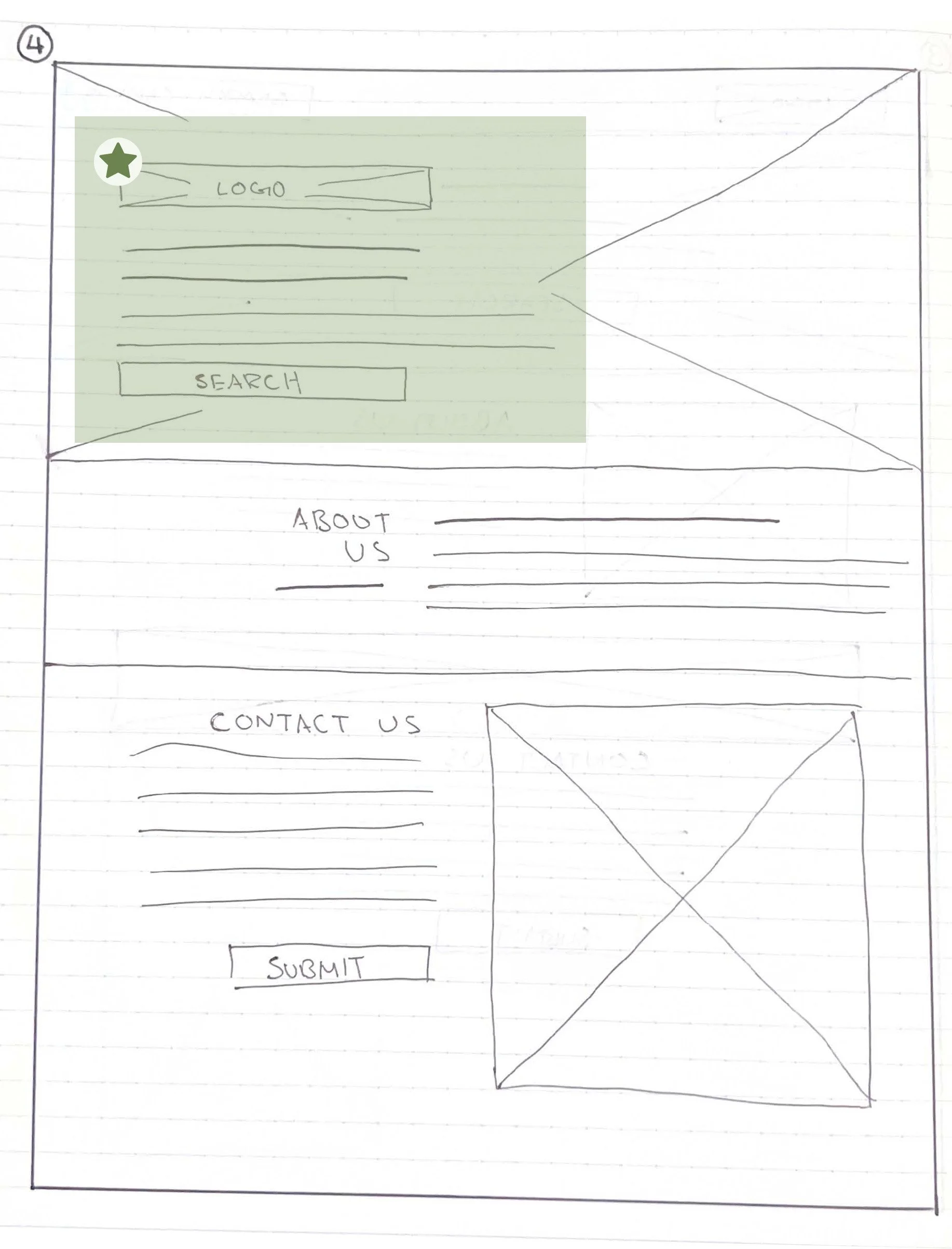
I really liked the header from this wireframe. Especially the collapsable menu nav.
I liked the layout of the search bar and contact us form section.
I liked how the search bar is in the nav and the top section of the page.
I liked how I incorporated the logo in the top section of the page.
On this page, I liked the images alternated between the two sides.
Keeping these in mind, below you can see the refined wireframe with all the elements combined.
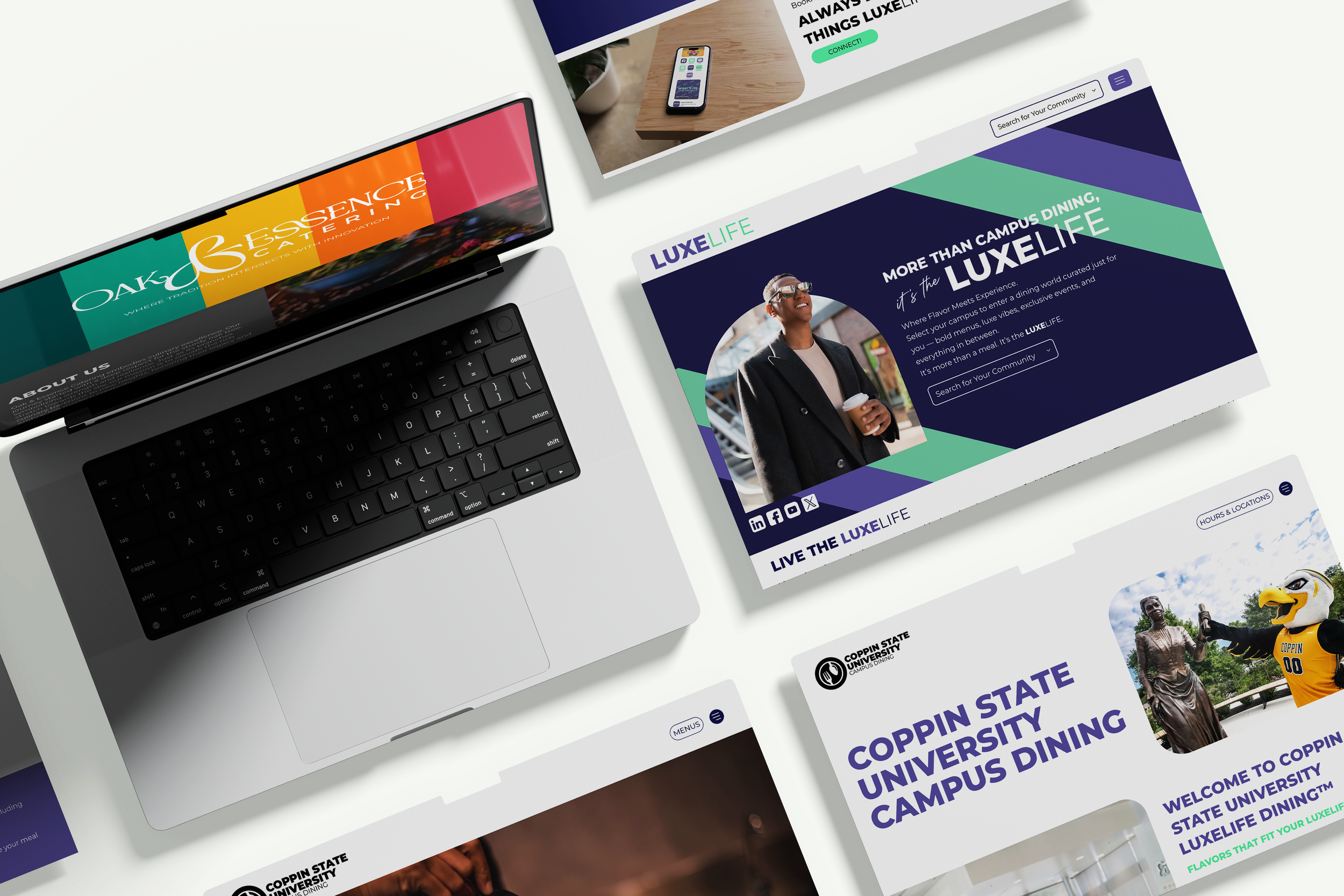
Hi-Fi Prototype:
Due to being the only person working on this project and the limitation of time, I decided to create the hi-fi prototype right on our website builder, Wix Studio. This way I can understand what is possible on the builder and what is not. Please view the final prototype below!
Step 5: Testing
Desired Outcome:
During this phase, I would like to identify how users interact with our product. Pinpoint usability issues, validation of design decision, and clear improvement opportunities. Discover where users struggle, get confused or cannot complete important tasks. Due to launch date rapidly approaching, I will revisit this phase during the semester. You can view my research study plan below!
UX Research plan
Project Background:
After designing the final product, the next step is to evaluate how well the experience works for students in real-world scenarios. The website was designed to help students quickly find essential information such as daily menus, dining hall hours, locations, and dietary options.
Because students often check dining information between classes or while on the go, it’s critical that the website allows users to find what they need quickly and intuitively. Usability testing will be conducted to ensure this product supports students’ needs and to identify any remaining usability issues.
Research Goals:
The primary goal of this research is to evaluate the usability of the final product and determine whether students can efficiently complete common tasks on the campus dining website.
Specifically, this research aimed to:
Validate that the website structure and navigation are intuitive
Evaluate how easily users can locate important dining information
Identify any remaining usability issues within the design
Understand how students interact with the interface
Gather feedback that could inform final design improvements
Research Questions:
This study focused on answering the following questions:
How intuitive is the website’s navigation and information structure?
Are users able to complete key tasks quickly and efficiently?
What challenges or frustrations do users experience while using the website.\Does the design support students who are quickly checking information between classes?
Key Performance Indicators (KPI’s):
To evaluate the effectiveness of the design, the following metrics were tracked:
Task Success Rate
The percentage of participants who were able to successfully complete assigned tasks.
Time on Task
How long it took participants to find key information.
Navigation Efficiency
The number of clicks or steps required to complete each task.
User Satisfaction
Participant feedback on how easy or difficult the experience felt.
Usability Issues Identified
Recurring pain points or areas of confusion observed during testing..
Methodology:
Moderated Usability Testing
Moderated usability testing sessions were conducted to observe how students interact with the final product. Participants were asked to complete common tasks while sharing their thoughts aloud.
Session Format
Moderated sessions conducted in person
Participants interacted with the final product
Session Length
15–20 minutes per participant
Data Collected
Observations of user behavior
Task completion rates
Time required to complete tasks
Verbal feedback from participants
Notes on usability issues
This approach allowed me to observe how users naturally navigate the interface and identify areas where the design could be improved.
Participants:
Participants were recruited from the website’s target audience: university students who regularly use campus dining services.
Participant Criteria
Currently enrolled university student
Uses campus dining locations
Has experience looking up dining information online
Sample Size
5–8 participants.
Script:
Introduction
“Thank you for participating in this usability study. Today we’ll be looking at your campus dining website.
The goal is to understand how students interact with the website. There are no right or wrong answers—we’re testing the design, not you. As you go through the tasks, please try to think out loud so I can understand your thought process.”
Warm-Up Questions
How often do you eat at campus dining locations?
Have you ever used a campus dining website before?
What information do you usually look for when deciding where to eat on campus?
Usability Test Tasks
Participants were asked to complete realistic tasks that reflect how students typically use a campus dining website.
Task 1
You want to see what’s being served today. Show me how you would find the menu for a dining hall.
Task 2
You’re planning dinner later tonight. Find the hours of operation for a dining location.
Task 3
You have a dietary restriction. Show me how you would locate dietary or allergen information.
Task 4
You heard about a new food location on campus. Show me how you would find where it is located.
Post-Test Questions
What parts of the website felt easy to use?
What parts felt confusing or difficult?
Was there any information you expected to find but couldn’t?
If you could change one thing about this website, what would it be?
Expected Outcomes
The usability testing results will help identify:
Any remaining navigation or usability issues
Opportunities to simplify how students access key information
Improvements that could make the experience faster and more intuitive
View Next Project!
View Next Project!

Tottenham Hotspurs: Landing Page
UI/UX | Web Design | Branding | Responsive Design